Key Performance Analysis Graph – Visualizing Business Growth
RM0300021_17
- Last Update 02/12/2025
- File Size 0.3MB
- # of Slides 2
- File Format PPTX
- Slide Ratio 16:9
- Color
Keywords
- #Content-Based Slides
- #Design-Based Slides
- #Company Introduction
- #Market and Competitor Analysis
- #Graph
- #Key Achievements
- #Market Analysis
- #Column
- #Grouped Column
- #16:9
- #grouped bar chart PowerPoint
- #multi-series bar graph slide
- #performance comparison template
- #business data visualization
- #how to create grouped chart in PowerPoint
About the Product
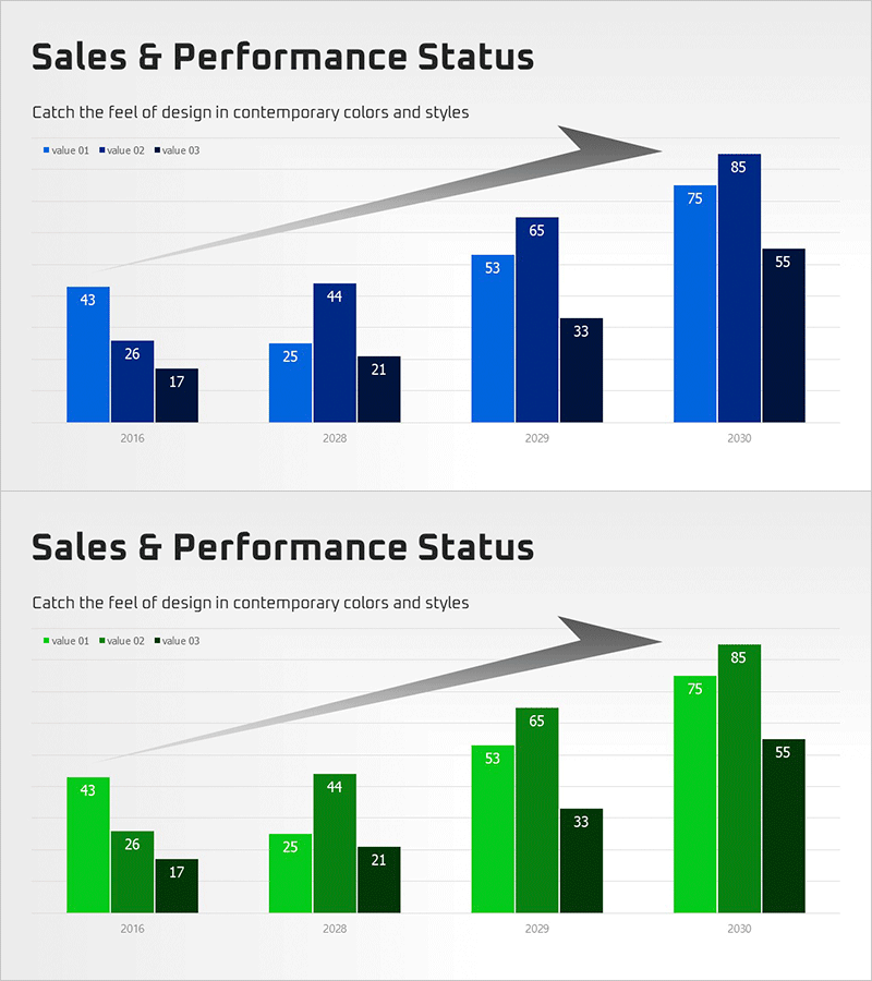
A grouped bar chart PowerPoint slide for visualizing sales and performance metrics across multiple data series. The slide features three shades of blue (light, medium, and dark) representing three value categories across four time periods (2016, 2028, 2029, 2030). An upward arrow element at the top emphasizes growth trends, while numerical labels are clearly displayed on each bar. This presentation template is ready to use in business reports, performance reviews, and quarterly results presentations.
Usage Points
-
Main Usage
Compare performance metrics year-over-year or across departments and product lines simultaneously. The three-series grouped format clearly visualizes differences between multiple data categories while emphasizing overall growth trajectory.
-
How to Use
Insert into performance analysis sections of business reports, quarterly earnings presentations, or departmental review meetings. Edit bar values with your own data and replace legend labels (value 01, 02, 03) with department names, product categories, or regional identifiers for immediate presentation use.
-
Recommended For
Sales, marketing, and finance professionals presenting performance reports. Ideal for executive briefings on quarterly results, investor presentations on business growth, and any multi-metric comparison requiring side-by-side data visualization.
-
Slide Structure
Two-slide set featuring grouped bar charts in different color schemes. First slide uses blue-tone bars (4 groups × 3 series), second slide uses green-tone bars with identical data structure. Both include title, subtitle, legend, and upward arrow accent elements.
Related Products
-

Achievement Performance and Goal Analysis Chart – Visualizing Performance
#Company Introduction #Market and Competitor Analysis #Graph
-

Year-by-Year Comparison Analysis Bundle Graph – Visualizing Market Performance
#Company Introduction #Market and Competitor Analysis #Diagram
-

Future Technology Business Analysis Chart – Performance Focus
#Company Introduction #Market and Competitor Analysis #Graph
-

Year-over-year Performance Comparison Chart – Key to Business Analysis
#Company Introduction #Market and Competitor Analysis #Diagram
