Year-over-year Performance Comparison Chart – Key to Business Analysis
RM0300007_17
- Last Update 02/08/2025
- File Size 1.4MB
- # of Slides 2
- File Format PPTX
- Slide Ratio 16:9
- Color
Keywords
- #Content-Based Slides
- #Design-Based Slides
- #Company Introduction
- #Market and Competitor Analysis
- #Diagram
- #Graph
- #Key Achievements
- #Market Analysis
- #Table
- #Column
- #Grouped Column
- #16:9
- #grouped bar chart PowerPoint
- #year-over-year performance comparison slide
- #business data visualization
- #bar chart PowerPoint template
- #performance analysis chart
- #annual comparison graph
About the Product
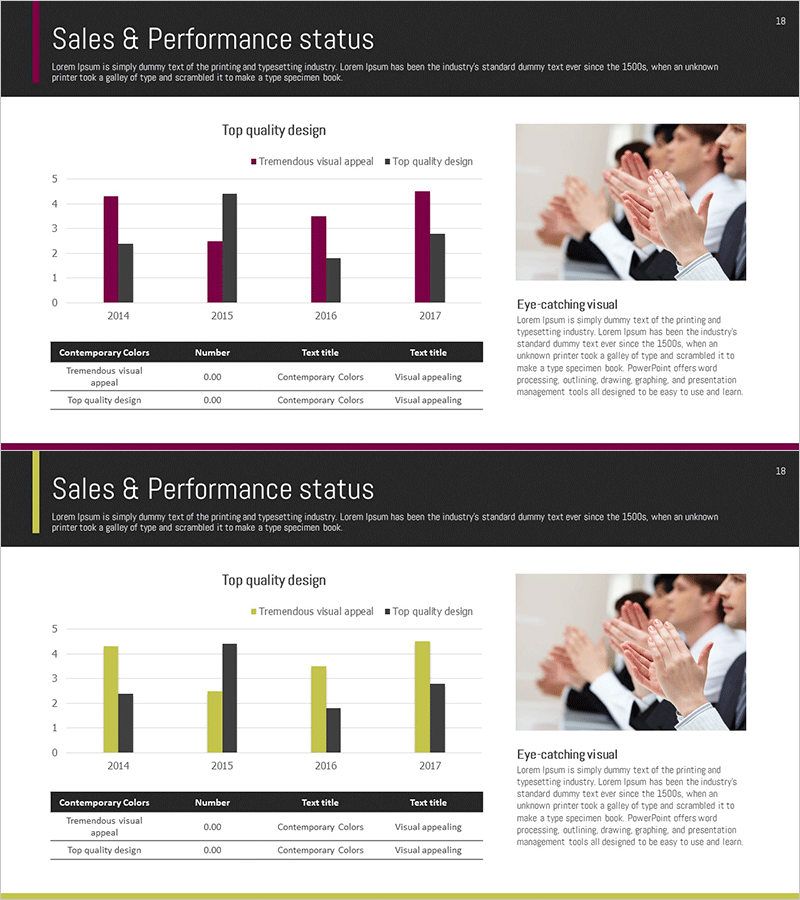
A grouped bar chart PowerPoint slide for comparing year-over-year performance data from 2014 to 2017. This presentation template visualizes two data series (Tremendous visual appeal and Top quality design) using contrasting deep burgundy and black bars to clearly distinguish each metric. Ideal for business performance analysis, market trend comparison, and sales results review in executive presentations. Provided in 16:9 widescreen format with 2 slides, featuring easy-to-edit data fields for quick customization and professional reporting.
Usage Points
-
Main Usage
Optimized for comparing two performance metrics across multiple years, enabling side-by-side analysis of revenue vs. customer satisfaction, market share vs. competitor performance, or any dual-metric business comparison. Clearly visualizes trends and performance gaps to support data-driven decision-making.
-
How to Use
Use in business performance reports, quarterly or annual results presentations, strategy meetings, and investor briefings. Simply modify the bar heights to input your actual data, update the legend and title to match your presentation context, and customize colors if needed for brand alignment.
-
Recommended For
Finance and planning teams presenting quarterly or annual results, C-suite executives reviewing business performance, investors evaluating company growth, marketing teams analyzing market data, and sales teams tracking goal achievement. Suitable for any business presentation requiring quantitative data comparison.
-
Slide Structure
2-slide set with each slide displaying 4 years of data (2014–2017) in grouped bar format. Deep burgundy and black bars are paired for each year, with a legend table (Contemporary Colors, Number, Text title) positioned at the bottom for data interpretation. Optimized for 16:9 widescreen display.
Related Products
-

Year-by-Year Comparison Analysis Bundle Graph – Visualizing Market Performance
#Company Introduction #Market and Competitor Analysis #Diagram
-

Sales & Performance Status Slide – Data-Driven Insights
#Company Introduction #Market and Competitor Analysis #Diagram
-

Multinational Market Analysis Indicators – Visualizing Market and Performance
#Company Introduction #Market and Competitor Analysis #Diagram
-

Graph Analysis of Growth – Data Visualization for Competitive Advantage
#Market and Competitor Analysis #Diagram #Graph
