User Analysis Donut Chart – Optimal for Market and Competitor Analysis
RM0300016_7
- Last Update 02/11/2025
- File Size 1.9MB
- # of Slides 2
- File Format PPTX
- Slide Ratio 16:9
- Color
Keywords
- #Content-Based Slides
- #Design-Based Slides
- #Market and Competitor Analysis
- #Graph
- #Other
- #Customer Analysis
- #Market Analysis
- #Circles
- #Doughnut Chart
- #Silhouette
- #16:9
- #donut chart PowerPoint
- #pie chart slide template
- #ratio analysis chart
- #customer analysis PPT
- #market share donut chart
- #how to create donut chart in PowerPoint
- #chart slide download
About the Product
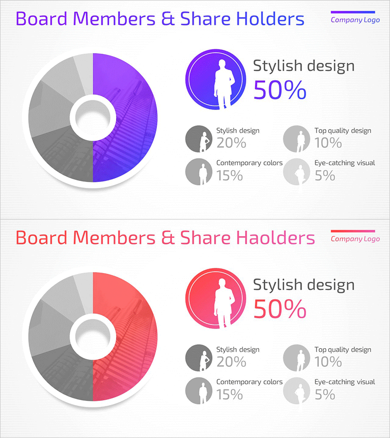
A professional donut chart PowerPoint slide designed for customer analysis and market research presentations. Available in two color versions—purple and red—each slide clearly displays the proportion of five data segments. The concentric circular structure with a hollow center allows you to emphasize data hierarchy and insert key metrics or titles in the center area. Ideal for competitor analysis, market share visualization, customer segmentation, and business metrics. The 16:9 widescreen format with 2 slides enables seamless integration into your presentation deck.
Usage Points
-
Main Usage
Designed to compare and highlight the proportion of five data categories at a glance. The hollow center area provides space for key metrics, titles, or summary text, maximizing visual impact. Effectively communicates competitor market share, customer segmentation, market composition, budget allocation, and other analytical data in an intuitive format.
-
How to Use
Input your data values into each donut segment, and the proportions will automatically adjust. Customize the legend labels and percentage values to match your presentation context. Choose between the purple or red color version based on your corporate brand colors, then edit the title and data fields as needed.
-
Recommended For
Ideal for marketing professionals, executives, consultants, and data analysts presenting market research findings, customer insights, and competitive analysis. Suitable for business plans, investor pitch decks, marketing strategy presentations, quarterly performance reports, and any data-driven decision-making document requiring clear ratio visualization.
-
Slide Structure
Each slide features a donut chart with five segments radiating from a central white circular area. The legend displaying item names and percentage values is positioned around the outer edge. A title area is provided at the top. The purple version uses dark purple, light purple, and gray tones, while the red version employs dark red, light red, and gray tones for segment differentiation.
Related Products
-

Work Performance Analysis Graph – Visually Representing Employee Performance
#Market and Competitor Analysis #Graph #Other
-

Gender Ratio Customer Analysis 3D Circle Graph – Insights for Market Understanding
#Market and Competitor Analysis #Graph #Other
-

User Analysis Graph by Year – Insights into Customer Behavior
#Market and Competitor Analysis #Graph #Other
-

Image Communication Tips for Job Seekers
#Market and Competitor Analysis #Other #Customer Analysis
