Sales and Profit Table – Visualizing Financial Performance
RJ0300038_10
- Last Update 04/28/2025
- File Size 0.1MB
- # of Slides 2
- File Format PPTX
- Slide Ratio 16:9
- Color
Keywords
- #Content-Based Slides
- #Design-Based Slides
- #Market and Competitor Analysis
- #Financial Plans and Performance
- #Diagram
- #Graph
- #Market Analysis
- #Sales and Revenue
- #Table
- #Column
- #Standard Table
- #Grouped Column
- #16:9
- #clustered column chart PowerPoint
- #sales vs profit comparison slide
- #financial performance template
- #2-series bar chart
- #business data visualization PowerPoint
About the Product
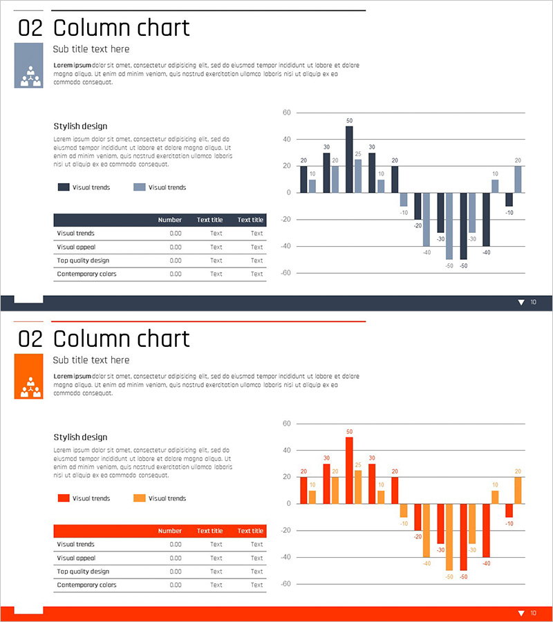
A clustered column chart PowerPoint slide comparing sales and profit across multiple periods using two data series. The design features navy and light blue color scheme for clear financial performance visualization, paired with a data table showing detailed figures. This 16:9 widescreen 2-slide template is ready to use in financial reports, quarterly earnings presentations, business performance reviews, and investor briefings. Data input fields are clearly marked for easy customization and rapid deployment.
Usage Points
-
Main Usage
Visualize and compare financial metrics across two data series (sales and profit) to communicate quantitative performance. Ideal for period-over-period analysis, goal vs. actual comparisons, profitability trends, and revenue breakdowns in executive presentations.
-
How to Use
Use in financial reports, quarterly earnings calls, investor presentations, board meetings, and management reviews. The dual chart-and-table layout enables comprehensive data storytelling—the chart shows trends visually while the table provides precise figures for credibility.
-
Recommended For
CFOs, finance managers, business analysts, department heads, and marketing strategists preparing quarterly or annual performance reports. Suitable for investor relations, shareholder meetings, internal management briefings, and any presentation requiring quantitative financial comparison.
-
Slide Structure
2-slide set with first slide displaying a clustered column chart (navy and light blue bars, 8–10 data points), second slide presenting the same data in table format (rows: categories, columns: sales, profit, variance). Legend, axis labels, and editable data fields are clearly defined.
Related Products
-

Animal Nature Conservation Program Facility Investment Plan Chart
#Market and Competitor Analysis #Financial Plans and Performance #Graph
-

Performance Analysis Table Slide – Market and Competitor Analysis
#Market and Competitor Analysis #Diagram #Graph
-

Horizontal Bar Chart Visualizing Market Sales Status
#Market and Competitor Analysis #Financial Plans and Performance #Graph
-

Competitor Comparison Analysis Graph - A Tool for Effective Market Analysis
#Market and Competitor Analysis #Diagram #Graph
