Performance Comparison Analysis Line & Donut Chart – Data Visualization for Market Understanding
RM0300006_17
- Last Update 02/08/2025
- File Size 1.5MB
- # of Slides 2
- File Format PPTX
- Slide Ratio 16:9
- Color
Keywords
- #Content-Based Slides
- #Design-Based Slides
- #Company Introduction
- #Market and Competitor Analysis
- #Graph
- #Key Achievements
- #Market Analysis
- #Circles
- #Line
- #Pie Chart
- #Line Chart
- #16:9
- #line chart PowerPoint
- #donut chart template
- #performance comparison slide
- #data visualization PPT
- #market analysis presentation
About the Product
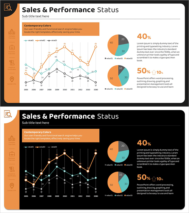
A professional PowerPoint slide combining line graph and donut chart for performance comparison analysis. The slide displays three data series from 2005 to 2020 using a multi-line chart, with corresponding donut chart segments showing 40%, 50%, and 10% proportions on the right. The orange and teal color scheme provides strong visual contrast for enhanced data readability. Ideal for market analysis, competitive benchmarking, quarterly performance reports, and investor presentations. Delivered in 16:9 PPTX format with two design variations—light and dark backgrounds—for flexible presentation contexts.
Usage Points
-
Main Usage
Communicate long-term trends and current composition ratios in a single visual. The line graph tracks three data series across 15 years, while the donut chart emphasizes current-state proportions. Perfect for quarterly earnings reports, market share analysis, competitive positioning, and strategic performance reviews.
-
How to Use
Replace the sample data points with your actual figures from financial reports, market research, or sales databases. Customize the legend labels and color scheme to match your corporate branding. Use in executive presentations, investor relations meetings, board reports, and strategic planning sessions. Both light and dark background versions are included for different presentation environments.
-
Recommended For
Finance teams, marketing departments, business development managers, sales executives, and strategic planners. Particularly suited for roles requiring quantitative analysis presentation—CFOs presenting quarterly results, product managers comparing market segments, consultants benchmarking competitive performance, and analysts explaining multi-variable trends.
-
Slide Structure
Two-slide set with identical layouts in light and dark themes. Each slide features a title area, multi-line graph with three data series (approximately 10–40 data points per series spanning 2005–2020), and a three-segment donut chart (40%, 50%, 10%) positioned on the right. Clear axis labels, gridlines, and legend ensure professional presentation quality.
Related Products
-

Performance Comparison Analysis Graph – Data-Driven Visualization
#Company Introduction #Market and Competitor Analysis #Diagram
-

Key Performance Bar & Line Analysis Chart – Integrated Market Performance Visualization
#Company Introduction #Market and Competitor Analysis #Graph
-

Multinational Market Analysis Indicators – Visualizing Market and Performance
#Company Introduction #Market and Competitor Analysis #Diagram
-

Infographic Slide for Data Visualization and Analysis
#Technical Approach #Market and Competitor Analysis #Graph
