Performance Comparison Analysis Graph – Data-Driven Visualization
RM0300005_17
- Last Update 02/08/2025
- File Size 1.3MB
- # of Slides 2
- File Format PPTX
- Slide Ratio 16:9
- Color
Keywords
- #Content-Based Slides
- #Design-Based Slides
- #Company Introduction
- #Market and Competitor Analysis
- #Diagram
- #Graph
- #Key Achievements
- #Market Analysis
- #Table
- #Line
- #Line Chart
- #16:9
- #line chart PowerPoint
- #performance comparison slide
- #dual-series trend visualization
- #data-driven presentation template
- #sales performance graph PowerPoint
About the Product
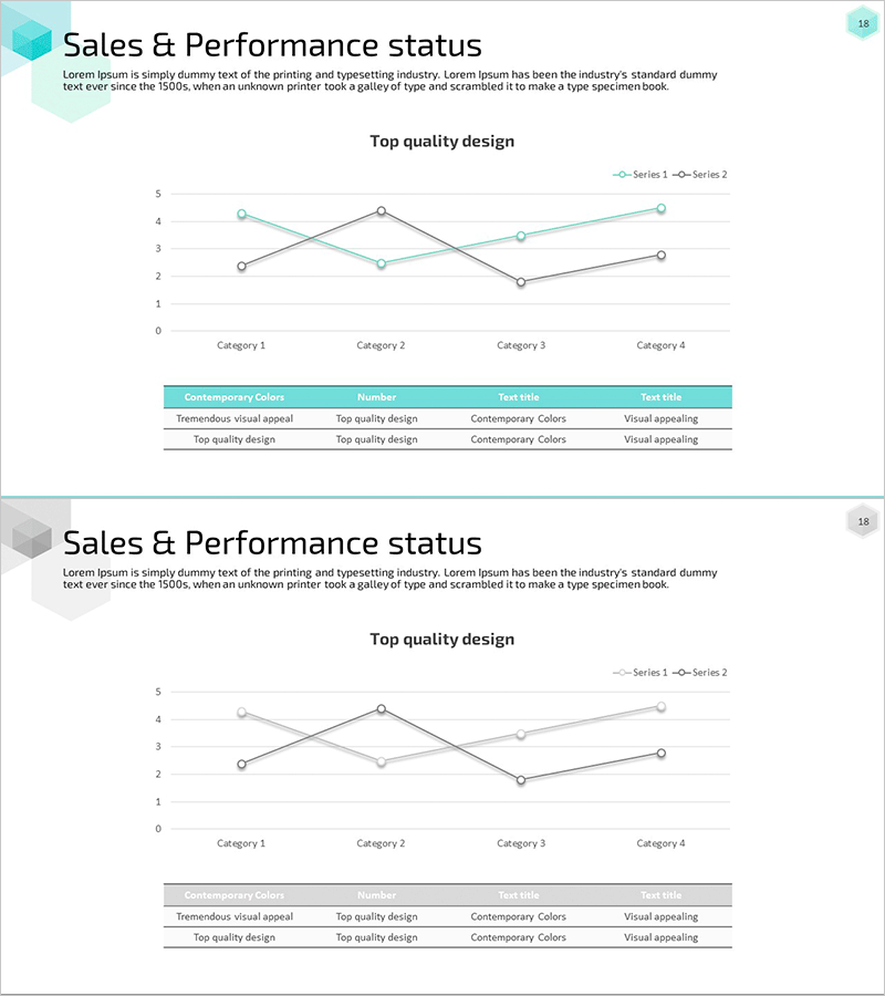
A PowerPoint slide that visualizes sales and performance metrics using two intersecting line series across four categorical intervals. This presentation template is optimized for comparative performance analysis, clearly distinguishing each data series through contrasting cyan and gray tones. Data point markers and a legend enable intuitive interpretation of trend changes. Ideal for market analysis presentations, sales performance reports, departmental performance reviews, and quantitative data-driven business discussions. Fully editable and ready for immediate use in executive briefings and strategic planning sessions.
Usage Points
-
Main Usage
Compares two performance indicators across time periods or categorical segments, clearly showing trend trajectories and intersection points. Suitable for sales metrics, market share analysis, departmental performance tracking, competitive benchmarking, and any quantitative comparison requiring visual trend identification.
-
How to Use
Replace the four category labels and Y-axis values with your actual data. Update the legend series names (Series 1 and Series 2) to reflect your specific metrics. Input your data points and the line chart automatically recalculates. Colors are fully customizable to match corporate branding guidelines.
-
Recommended For
Sales and marketing team performance reports, executive management briefings, consulting proposal market analysis sections, investor pitch deck performance metrics, business education seminars, quarterly business reviews, and strategic planning presentations requiring comparative trend analysis.
-
Slide Structure
Title area, dual-series line chart with four X-axis categories and 0-5 Y-axis scale, legend identifying Series 1 and Series 2, and bottom information table with four columns (Contemporary Colors, Number, Text title, Text title). Optimized for 16:9 widescreen format as a 2-slide set.
Related Products
-

Multinational Market Analysis Indicators – Visualizing Market and Performance
#Company Introduction #Market and Competitor Analysis #Diagram
-

Spending Growth Graph – Market and Competitive Analysis
#Market and Competitor Analysis #Financial Plans and Performance #Diagram
-

Yellow Red Line Charts and Tables – Market Status Analysis
#Market and Competitor Analysis #Diagram #Graph
-

Industry-leading Key Performance Analysis Charts
#Company Introduction #Market and Competitor Analysis #Diagram
