Brown Blue Detailed Analysis Chart - Market and Competitor Analysis
RJ0900031_11
- Last Update 08/25/2025
- File Size 0.2MB
- # of Slides 2
- File Format PPTX
- Slide Ratio 16:9
- Color
Keywords
- #Content-Based Slides
- #Design-Based Slides
- #Market and Competitor Analysis
- #Diagram
- #Graph
- #Market Analysis
- #Competitive Advantage
- #Table
- #Line
- #Standard Table
- #Line Chart
- #16:9
- #line chart PowerPoint slide
- #trend analysis presentation
- #multi-series line graph
- #market analysis chart
- #competitor comparison slide
- #PowerPoint data visualization
- #how to create line chart in PowerPoint
About the Product
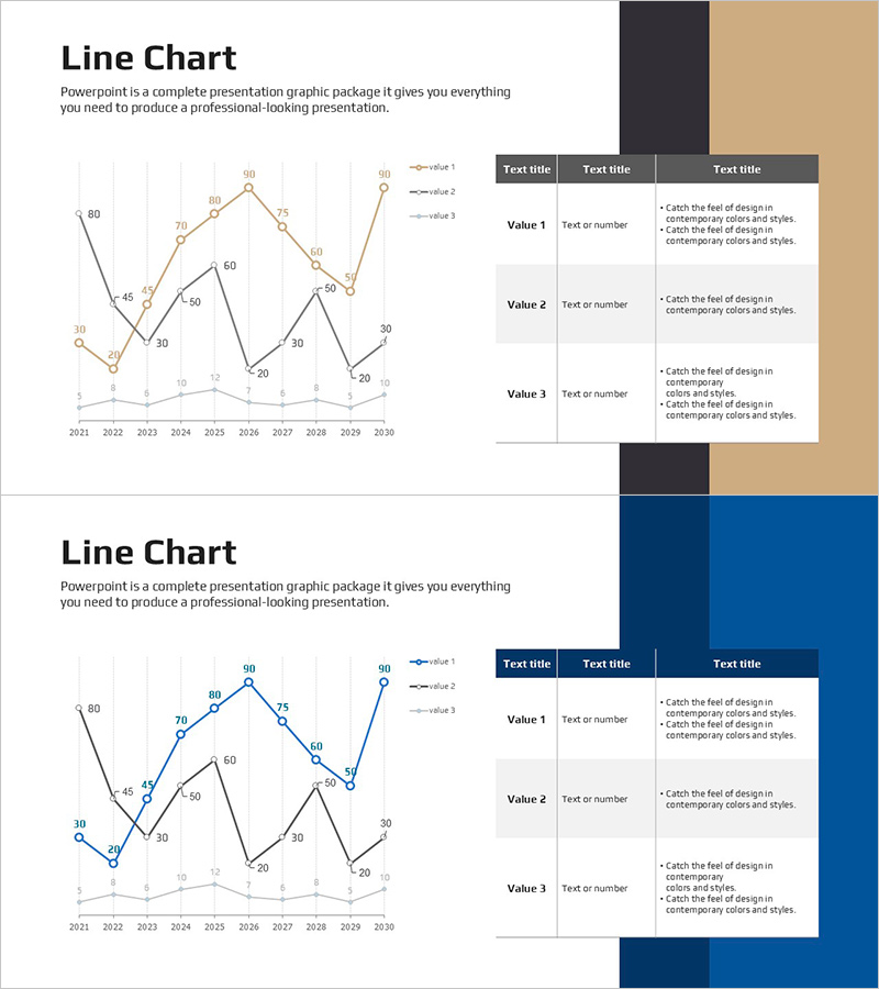
A multi-series line chart PowerPoint slide comparing 10 years of market data from 2021 to 2030 across three distinct data series. The design features a brown and blue two-tone background with orange, gray, and black line colors for clear data differentiation. Each data point is labeled with numerical values for precise comparison, and a structured table on the right side provides space for detailed descriptions of three key metrics. This presentation slide is ready to use for market analysis, competitor benchmarking, performance reporting, and strategic planning presentations.
Usage Points
-
Main Usage
Display and compare multiple data series over time to reveal market trends, performance patterns, and competitive positioning. The three-line structure enables simultaneous analysis of different metrics, making it ideal for identifying growth trajectories, market shifts, and strategic opportunities.
-
How to Use
Input your actual data values into the left-side line chart, replacing the sample 2021-2030 timeline and data points. Complete the right-side table with metric names, values, and supporting insights. During presentation, use the chart's peaks, valleys, and inflection points to narrate market dynamics and explain strategic responses.
-
Recommended For
Marketing managers, business analysts, and strategy consultants presenting market research, sales performance, or competitive analysis. Suitable for investor pitches, executive briefings, board meetings, and strategic planning sessions where data-driven decision-making is essential.
-
Slide Structure
Left section contains a line chart with X-axis spanning 2021-2030 (10 years) and Y-axis ranging 0-90. Three data series displayed in orange, gray, and black lines with labeled data points at each interval. Right section features a 3-row × 3-column table with headers 'Text title' and rows for Value 1, Value 2, and Value 3, each with text and number input areas.
Related Products
-

Key Performance Analysis Graph – The Power of Data Visualization
#Company Introduction #Market and Competitor Analysis #Diagram
-

Line Chart of the Violence Survey – Market Analysis and Competitive Advantage
#Market and Competitor Analysis #Graph #Market Analysis
-

Target Market Trend Analysis Graph by Year – Market and Competitor Analysis
#Market and Competitor Analysis #Diagram #Graph
-

Usage Analysis Graph – Visualizing Market Status
#Market and Competitor Analysis #Diagram #Graph
