Key Performance Comparison Analysis Bar Graph
RM0300003_17
- Last Update 02/07/2025
- File Size 0.3MB
- # of Slides 2
- File Format PPTX
- Slide Ratio 16:9
- Color
Keywords
- #Content-Based Slides
- #Design-Based Slides
- #Company Introduction
- #Market and Competitor Analysis
- #Diagram
- #Graph
- #Key Achievements
- #Market Analysis
- #Table
- #Horizontal Bar
- #Horizontal Bar Chart
- #16:9
- #horizontal bar chart PowerPoint
- #performance comparison slide
- #KPI analysis template
- #data visualization presentation
- #bar graph slide design
About the Product
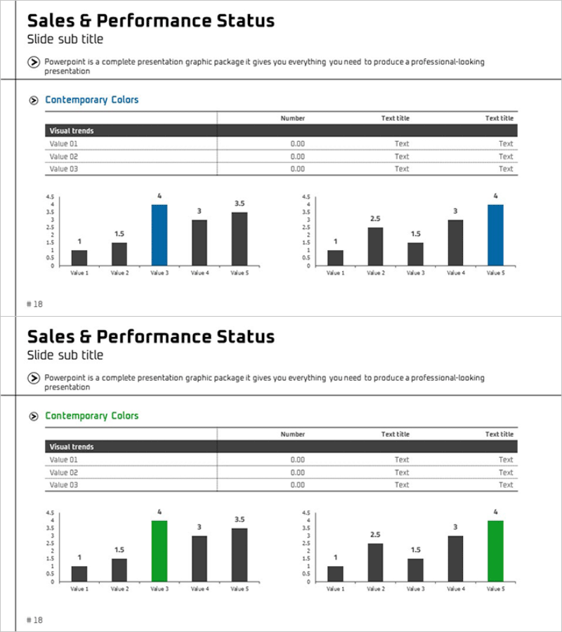
A horizontal bar chart PowerPoint slide designed to visually compare and analyze key performance metrics across five data points. This 2-slide presentation template uses a dual-tone color scheme with black and blue accents to highlight top performers and draw attention to critical insights. Each slide maintains consistent data structure while varying color placement to adapt to different presentation contexts. Provided in 16:9 widescreen PPTX format with clearly defined data input areas and legends for immediate editing and customization.
Usage Points
-
Main Usage
Enables side-by-side comparison of quarterly, annual, or departmental performance metrics using horizontal bars to instantly convey relative magnitude and ranking. Color differentiation highlights top-performing items while numerical data visualization supports data-driven decision-making and strategic discussions.
-
How to Use
Deploy in executive briefings, quarterly business reviews, and performance analysis sessions to present KPI comparisons. Input actual metrics into the data table and the bar charts automatically reflect changes. Use color emphasis to spotlight highest-performing categories and drive narrative focus during presentations.
-
Recommended For
Finance, sales, and marketing teams presenting monthly or quarterly performance reports. Ideal for executive-level business reviews, investor presentations, and cross-departmental performance benchmarking. Best suited for comparing 5–10 data points with clear numerical values.
-
Slide Structure
Two-slide layout with consistent structure: title and subtitle area, 5-row × 3-column data input table, and two horizontal bar charts displaying five items each. First slide features black and blue color scheme; second slide uses black and green for visual variety and comparative emphasis.
Related Products
-

Key Business Performance Analysis Chart – A Measure of Trust
#Company Introduction #Market and Competitor Analysis #Diagram
-

Future Outlook & Competitor Analysis Chart
#Company Introduction #Market and Competitor Analysis #Diagram
-

Performance Analysis 3D Bar Chart & Table – Market and Performance Analysis
#Company Introduction #Market and Competitor Analysis #Diagram
-

Product Top Sales Analysis Graph – Market and Competitor Analysis
#Business Strategy #Market and Competitor Analysis #Diagram
