Food Preference Analysis – Data Visualization Slide
RM0200020_4
- Last Update 11/10/2025
- File Size 6.8MB
- # of Slides 2
- File Format PPTX
- Slide Ratio 16:9
- Color
Keywords
- #Content-Based Slides
- #Design-Based Slides
- #Company Introduction
- #Financial Plans and Performance
- #Graph
- #Key Achievements
- #Projected Return on Investment (ROI)
- #Circles
- #Doughnut Chart
- #16:9
- #donut chart PowerPoint slide
- #pie chart template
- #data visualization presentation
- #ratio analysis chart
- #consumer preference slide template
About the Product
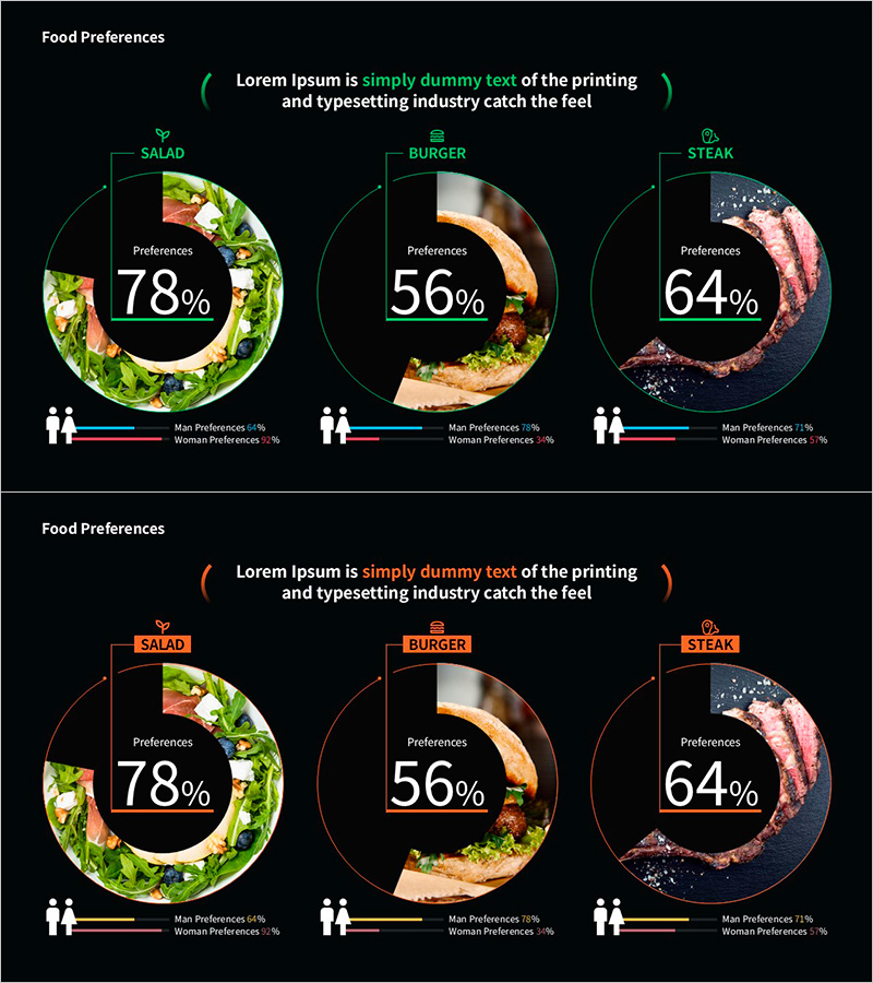
A donut chart PowerPoint slide designed for food preference analysis and consumer data visualization. The slide displays three data categories with percentage values in the center circle, while actual product images are positioned around the outer ring for intuitive visual representation. A comparative bar graph at the bottom shows male and female preference breakdowns, enabling demographic analysis. The 2-slide set includes green and orange color themes, both in 16:9 widescreen PPTX format ready for immediate editing and customization.
Usage Points
-
Main Usage
Visualize food and beverage preference surveys, consumer analysis data, and market research findings using a donut chart format. The combination of central percentage values and outer ring images enables simultaneous communication of quantitative metrics and qualitative context.
-
How to Use
Input percentage values for each category and the donut chart automatically calculates proportions. Replace the outer ring images with your product or category photos, then update the bottom bar graph with your male/female demographic data. Select either the green or orange color theme based on your presentation context and brand guidelines.
-
Recommended For
Market research reports for food and beverage companies, consumer analysis presentations, target audience sections in marketing plans, customer preference analysis in sales proposals, and survey result visualizations in academic presentations.
-
Slide Structure
Slide 1 (green theme): Center donut chart with 3 segments (78%, 56%, 64%), outer ring with salad/burger/steak images, bottom comparative bar graph for gender preferences. Slide 2 (orange theme): identical structure with alternate color scheme. Both slides in 16:9 widescreen layout.
Related Products
-

Premium Management Presentation – Pie Business Model
#Company Introduction #Financial Plans and Performance #Graph
-

Achievement Performance and Goal Analysis Chart – Visualizing Performance
#Company Introduction #Market and Competitor Analysis #Graph
-

Newspaper Wide PowerPoint Template with Donut Chart for Key Achievements
#Company Introduction #Product/Service Introduction #Graph
-

Market Share Donut Pie Chart – Visualization of Data Analysis
#Company Introduction #Market and Competitor Analysis #Diagram
