User Rating Analysis Chart – Visualizing Customer Insights
RM0200016_15
- Last Update 02/06/2025
- File Size 0.3MB
- # of Slides 2
- File Format PPTX
- Slide Ratio 16:9
- Color
Keywords
- #Content-Based Slides
- #Design-Based Slides
- #Market and Competitor Analysis
- #Diagram
- #Graph
- #Customer Analysis
- #Market Analysis
- #Table
- #Column
- #Grouped Column
- #16:9
- #grouped bar chart PowerPoint
- #customer rating analysis slide
- #dual-series comparison chart
- #data visualization template
- #market analysis presentation slide
About the Product
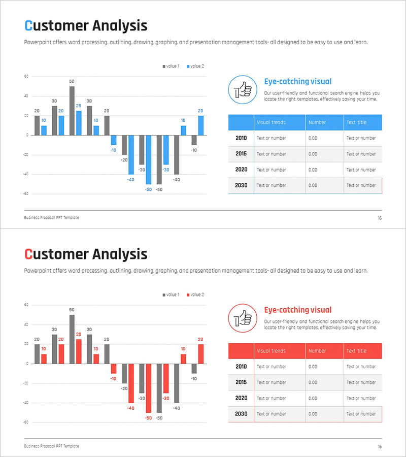
A grouped bar chart PowerPoint slide designed to visualize user ratings and customer insights through dual-series comparison. The slide features both horizontal and vertical bar configurations, allowing simultaneous comparison of positive and negative data with blue and gray color differentiation. The 2-slide set is ready for immediate use in customer analysis scenarios, market research presentations, satisfaction surveys, and competitive benchmarking. Data labels are clearly displayed for precise information delivery, and the 16:9 widescreen format ensures compatibility with modern presentation environments.
Usage Points
-
Main Usage
This slide is optimized for comparing customer ratings, satisfaction scores, and market data across two data series. It supports contrast analysis such as positive vs. negative feedback, competitive benchmarking, and year-over-year trends, with data labels ensuring accurate information delivery in business presentations.
-
How to Use
Use the horizontal bar slide to compare ratings by category, and the vertical bar slide to show changes over time. Maintain the blue and gray color scheme or customize with brand colors. Edit the data values and legend labels to input your actual metrics, and adjust the number of categories or time periods as needed.
-
Recommended For
Marketing teams presenting customer satisfaction surveys, executive reports on market analysis, sales teams conducting competitive comparisons, research institutions publishing data analysis reports, and consulting firms delivering strategic proposals.
-
Slide Structure
The 2-slide set includes a horizontal grouped bar chart (2 series, approximately 8-10 categories) and a vertical grouped bar chart (2 series, approximately 4-5 time periods). Each slide contains a title, legend, and data labels with blue (Value 1) and gray (Value 2) series differentiation.
Related Products
-

Sales & Performance Status Slide – Data-Driven Insights
#Company Introduction #Market and Competitor Analysis #Diagram
-

Senior Lifestyle Market Analysis PowerPoint Template
#Market and Competitor Analysis #Diagram #Graph
-

Table Chart & Clustered Column Graph – Market and Competitor Analysis
#Market and Competitor Analysis #Diagram #Graph
-

User Analysis Bar Graph – Providing Customer Insights
#Market and Competitor Analysis #Graph #Customer Analysis
