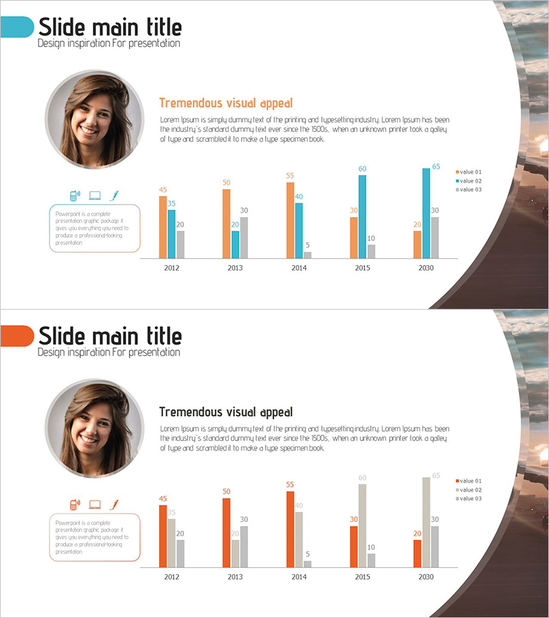
User Analysis Bar Graph – Providing Customer Insights
RJ0300067_5
- Last Update 05/07/2025
- File Size 1.7MB
- # of Slides 2
- File Format PPTX
- Slide Ratio 16:9
- Color
Keywords
- #Content-Based Slides
- #Design-Based Slides
- #Market and Competitor Analysis
- #Graph
- #Customer Analysis
- #Market Analysis
- #Column
- #Grouped Column
- #16:9
- #grouped bar chart PowerPoint
- #user analysis slide template
- #customer insights visualization
- #market analysis chart PPT
- #data comparison bar graph
- #PowerPoint graph slide design
About the Product
A grouped bar chart PowerPoint slide designed to visualize user analysis and customer insights. This presentation template displays three data series (orange, blue, and gray bars) side by side across five-year intervals from 2012 to 2030, enabling clear comparison of numerical changes and inter-series relationships. The layout includes a profile photo, descriptive text, and legend, making it ready for immediate use in marketing reports, market analysis, and customer segmentation presentations. Delivered in 16:9 widescreen format with 2 slides for flexible deployment across various presentation environments.
Usage Points
-
Main Usage
This slide visualizes customer analysis, market research, and user segmentation data by year and series. The grouped bar structure allows viewers to instantly compare numerical differences and trend changes across three data categories, serving as critical evidence in marketing reports, business analysis, and customer insight presentations.
-
How to Use
The slide layout positions a profile photo, title, and descriptive text on the left, with the grouped bar chart on the right. A legend (value 01, 02, 03) clearly distinguishes the three data series, while numerical values displayed above each bar ensure precise data communication. All colors, values, and categories are fully editable, allowing customization to match your specific analysis results.
-
Recommended For
Ideal for marketing teams presenting customer segmentation analysis, executive quarterly and annual performance reports, market research institutions visualizing survey data, consulting firms presenting client insights, and sales teams demonstrating customer behavior analysis. Recommended for any business presentation requiring data-driven decision-making and comparative analysis.
-
Slide Structure
Two-slide set featuring identical layouts with alternate color schemes. Each slide comprises a profile section (circular photo, title, descriptive text) and a chart section (5-year data × 3-series grouped bars with legend). Formatted in 16:9 widescreen to optimize for contemporary presentation platforms and display systems.
Related Products
-

Comparative Chart of Male and Female Professionals
#Market and Competitor Analysis #Graph #Other
-

User Rating Analysis Chart – Visualizing Customer Insights
#Market and Competitor Analysis #Diagram #Graph
-

User Analysis Graph by Age Group – Advanced Data Insights
#Market and Competitor Analysis #Diagram #Graph
-

Layout Design Presentation Template for Market & Competitor Analysis – Column Chart
#Market and Competitor Analysis #Graph #Customer Analysis
