Main Business and Performance Analysis Graph – Insights Based on Data
RM0200012_6
- Last Update 02/04/2025
- File Size 4.2MB
- # of Slides 2
- File Format PPTX
- Slide Ratio 16:9
- Color
Keywords
- #Content-Based Slides
- #Design-Based Slides
- #Company Introduction
- #Business Introduction
- #Graph
- #Key Achievements
- #Business Areas
- #Line
- #Line Chart
- #16:9
- #multi-line chart PowerPoint
- #trend analysis slide template
- #4-series performance graph
- #business performance PPT slide
- #annual data comparison presentation
About the Product
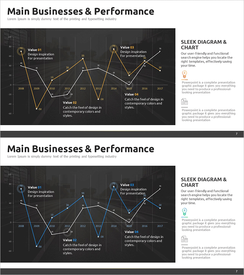
A multi-line trend chart PowerPoint slide template displaying 10 years of business performance data (2008–2017) across four distinct series. The dark background with gold, white, and blue line colors creates a professional visual hierarchy that clearly shows performance fluctuations and comparative trends. Each slide includes four Value callout boxes with icon and text areas for highlighting key insights and analysis points. The grid background facilitates precise data reading and numerical comparison. This presentation slide is ready to use for executive performance reports, quarterly business reviews, departmental KPI tracking, and strategic performance analysis across multiple business units.
Usage Points
-
Main Usage
Visualize year-over-year, department-by-department, or business-unit performance changes using time-series data to emphasize critical insights in executive dashboards, quarterly business reviews, and strategic performance presentations.
-
How to Use
Replace the line colors and data points with your actual performance metrics, then populate the four Value callout boxes with key findings and analytical commentary. The grid background aids numerical comparison, while the dark tone establishes a professional presentation atmosphere.
-
Recommended For
CFO and finance teams presenting quarterly earnings, business unit leaders analyzing departmental performance, investor relations teams explaining business results, marketing teams tracking campaign effectiveness trends, and executive leadership during annual planning and board meetings.
-
Slide Structure
Two-slide template. Each slide features a multi-line trend chart with 10 data points (2008–2017) across four series, grid background, and four Value callout boxes with icon placeholders and text areas. Formatted in 16:9 widescreen for modern presentation environments.
Related Products
-

Photo Business Market Analysis - Insights through Data Visualization
#Company Introduction #Business Introduction #Diagram
-

Key Revenue Analysis Chart by Year – A Snapshot of Business Performance
#Company Introduction #Business Introduction #Diagram
-

Main Business Analysis Graph – Performance Insights
#Company Introduction #Business Introduction #Diagram
-

Positive Performance Analysis Chart
#Company Introduction #Market and Competitor Analysis #Graph
