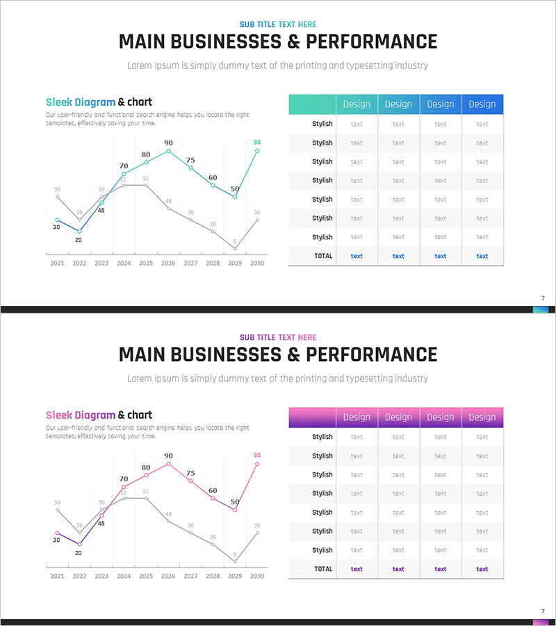
Key Revenue Analysis Chart by Year – A Snapshot of Business Performance
RM0200010_6
- Last Update 02/04/2025
- File Size 0.3MB
- # of Slides 2
- File Format PPTX
- Slide Ratio 16:9
- Color
Keywords
- #Content-Based Slides
- #Design-Based Slides
- #Company Introduction
- #Business Introduction
- #Diagram
- #Graph
- #Key Achievements
- #Business Areas
- #Table
- #Line
- #Standard Table
- #Line Chart
- #16:9
- #line chart PowerPoint
- #multi-series trend analysis slide
- #year-over-year revenue presentation
- #business performance data visualization
- #how to create line chart in PowerPoint
About the Product
A professional line chart PowerPoint slide visualizing 10-year revenue trends from 2021 to 2030. Two data series are overlaid for easy comparative analysis, with teal and gray color schemes clearly distinguishing each series. The accompanying data table offers 4 customizable style options to match your corporate branding. Delivered in 16:9 widescreen PPTX format, ready for immediate editing and presentation use.
Usage Points
-
Main Usage
Visualize time-series data such as annual sales, revenue, or performance metrics with clear trend lines, enabling simultaneous comparison of 2 or more indicators. Ideal for executive reports, business performance presentations, and financial analysis decks where stakeholders need to grasp revenue trajectory at a glance.
-
How to Use
Input your actual data into the line chart on the left side of the slide, then select from 4 style options (teal, pink, purple, or blue) in the right-side table to align with your corporate identity. Modify legend labels and axis titles to match your presentation context.
-
Recommended For
CFOs, finance managers, executives, and business development teams presenting quarterly or annual performance; marketing teams analyzing campaign effectiveness over time; consultants explaining trend shifts to clients; analysts comparing multi-year KPIs.
-
Slide Structure
2-slide set. Slide 1 features a dual-series line chart (2021–2030, 10 data points) with a 7-row × 4-column data table offering style variations. Slide 2 provides an alternate design using pink and purple color schemes. 16:9 aspect ratio, fully editable PPTX.
Related Products
-

Photo Business Market Analysis - Insights through Data Visualization
#Company Introduction #Business Introduction #Diagram
-

Main Business and Performance Analysis Graph – Insights Based on Data
#Company Introduction #Business Introduction #Graph
-

Analysis Table of Main Business Areas – The Power of Visual Data
#Company Introduction #Business Introduction #Diagram
-

Key Performance Analysis Graph – The Power of Data Visualization
#Company Introduction #Market and Competitor Analysis #Diagram
