Key Performance Analysis Graph – The Power of Data Visualization
RM0200003_6
- Last Update 02/01/2025
- File Size 3.5MB
- # of Slides 2
- File Format PPTX
- Slide Ratio 16:9
- Color
Keywords
- #Content-Based Slides
- #Design-Based Slides
- #Company Introduction
- #Market and Competitor Analysis
- #Diagram
- #Graph
- #Key Achievements
- #Competitive Advantage
- #Table
- #Line
- #Standard Table
- #Line Chart
- #16:9
- #line chart PowerPoint
- #multi-series chart template
- #performance trend analysis slide
- #business data visualization
- #how to create line graph in PowerPoint
About the Product
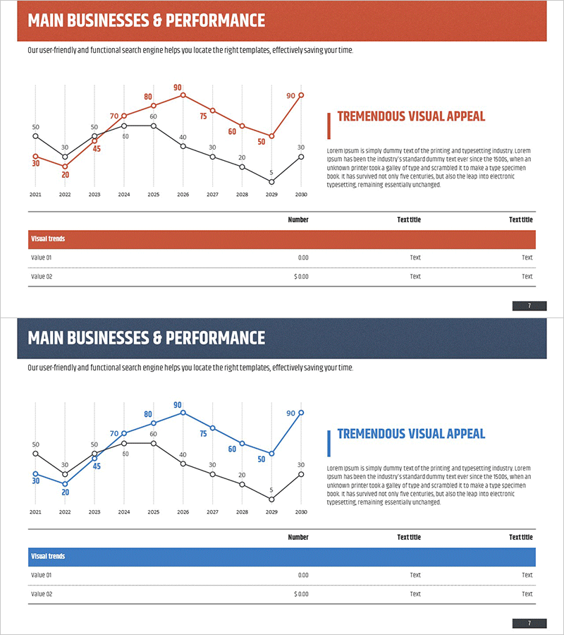
A professional line chart PowerPoint slide visualizing key performance metrics from 2021 to 2030 with dual data series in orange and blue. This presentation template clearly displays year-over-year trends and comparative analysis, making it ideal for business reports, earnings presentations, and market analysis decks. Optimized for 16:9 widescreen format with 2 slides, featuring clearly labeled data points and numerical values for enhanced audience comprehension. Fully editable for immediate use in corporate presentations, investor pitches, and performance review slides.
Usage Points
-
Main Usage
Effectively communicate annual performance metrics, revenue trends, market share evolution, and KPI changes over time. The dual-series format enables simultaneous comparison of related datasets, revealing correlations and patterns at a glance. Ideal for executive briefings, investor relations presentations, and strategic performance reviews where data credibility is paramount.
-
How to Use
Replace the sample data points and numerical values with your actual performance metrics. Edit the year labels, series names, and data values to automatically update the chart visualization. Customize colors and fonts to match your corporate branding guidelines. Insert into report sections or presentation decks to strengthen data-driven narratives and analytical credibility.
-
Recommended For
Finance teams conducting quarterly and annual performance analysis, marketing departments tracking campaign effectiveness, sales teams reporting against targets, and executives presenting board-level performance reviews. Essential for business plans, investor pitch decks, earnings reports, and strategic planning presentations.
-
Slide Structure
Two-slide set featuring individual line charts emphasizing orange and blue data series respectively. Each slide includes a title area, chart visualization with gridlines, legend, data point labels with numerical values, and a text box for key insights. Layout supports both standalone use and integration into larger presentation decks.
Related Products
-

Competitor Comparison Graph & Table - Essential Tool for Market Analysis
#Market and Competitor Analysis #Diagram #Competitor Analysis
-

Visualizing Market Analysis with Line Chart – Harmony of Mint and Orange
#Market and Competitor Analysis #Diagram #Graph
-

Comparison Graph of Yearly Trends – Market and Competitor Analysis
#Market and Competitor Analysis #Diagram #Graph
-

Brown Blue Detailed Analysis Chart - Market and Competitor Analysis
#Market and Competitor Analysis #Diagram #Graph
