Service Technology Analysis Circle Graph – Market Analysis and Technology Status
RM0200010_17
- Last Update 02/04/2025
- File Size 0.3MB
- # of Slides 2
- File Format PPTX
- Slide Ratio 16:9
- Color
Keywords
- #Content-Based Slides
- #Design-Based Slides
- #Business Introduction
- #Market and Competitor Analysis
- #Diagram
- #Graph
- #Technological Status
- #Market Analysis
- #Table
- #Circles
- #Doughnut Chart
- #16:9
- #donut chart PowerPoint slide
- #pie chart template
- #ratio analysis presentation
- #data visualization slide
- #4-segment chart
- #how to create donut chart in PowerPoint
About the Product
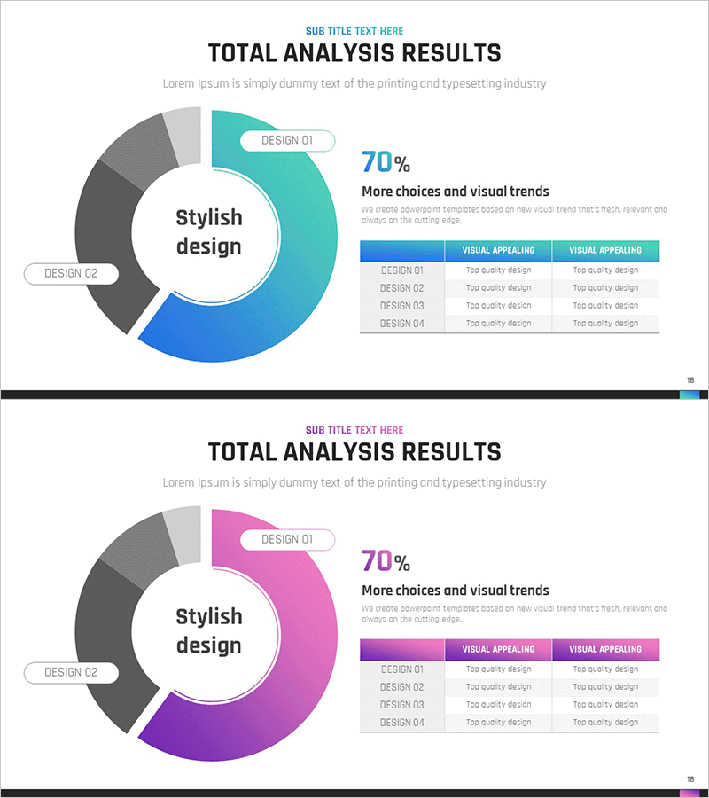
A donut chart PowerPoint slide designed for service technology analysis and market composition visualization. This template features a central messaging area surrounded by four segments displaying proportional data in teal, blue, and gray gradient tones. Each segment includes labels, percentage values, and descriptive text for clear data hierarchy. The 2-slide set (16:9 widescreen format) is ready for immediate use in presentations, reports, and strategic planning documents. Ideal for comparing service components, technology status, and market distribution across multiple categories.
Usage Points
-
Main Usage
Visualizes service technology analysis, market composition ratios, and technology distribution across four key segments. The donut structure places a core concept in the center while surrounding segments display proportional data as percentages, enabling stakeholders to grasp overall composition at a glance.
-
How to Use
Insert this slide into the analysis or results section of your presentation to communicate quantitative data effectively. Edit each segment's color and percentage values to match your actual data, and replace the central text with your analysis topic. Applicable to reports, strategic plans, and investor presentations requiring ratio comparisons.
-
Recommended For
Marketing professionals, business analysts, strategists, and executives presenting market analysis, technology status, or service composition. Particularly effective for executive briefings, investor presentations, and strategic planning meetings where quantitative insights must be communicated clearly.
-
Slide Structure
Two-slide set featuring teal-and-blue donut chart on slide 1 and magenta-and-purple variant on slide 2. Each slide contains a central circular text area for core messaging, four surrounding segments with label and percentage fields, and an accompanying comparison table for detailed data reference.
Related Products
-

Big Data Comprehensive Analysis Chart – Insights for Market Analysis
#Business Introduction #Market and Competitor Analysis #Diagram
-

Big Data Development Status Analysis Graph – Visualizing Business Strategy
#Product/Service Introduction #Business Introduction #Diagram
-

Drug Addiction Risk Analysis Graph Chart – Insightful Information Delivery
#Market and Competitor Analysis #Diagram #Graph
-

Shareholder Status Analysis Donut Pie Chart – Corporate Growth and Competitive Analysis
#Company Introduction #Market and Competitor Analysis #Diagram
