Sales and Profit Analysis Graph – Market Trends and Forecast
RM0100017_10
- Last Update 01/30/2025
- File Size 1MB
- # of Slides 2
- File Format PPTX
- Slide Ratio 16:9
- Color
Keywords
- #Content-Based Slides
- #Design-Based Slides
- #Market and Competitor Analysis
- #Diagram
- #Graph
- #Competitor Analysis
- #Market Analysis
- #Table
- #Line
- #Standard Table
- #Line Chart
- #16:9
- #line chart PowerPoint slide
- #sales trend analysis template
- #dual-series data visualization
- #revenue graph PPT
- #how to create trend chart in PowerPoint
- #market status slide download
About the Product
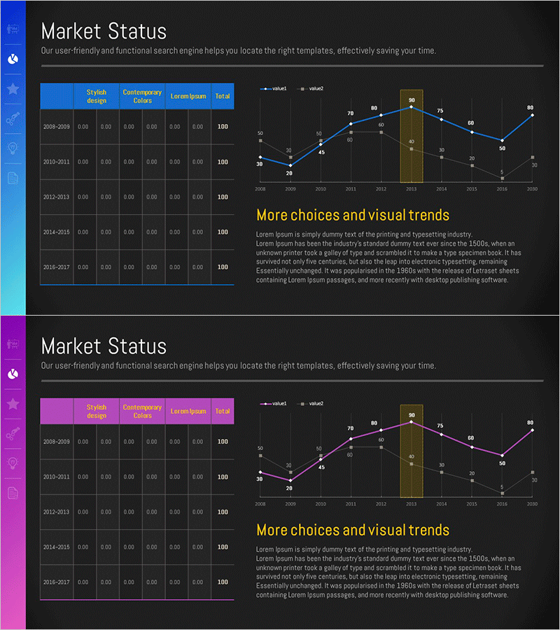
A PowerPoint slide featuring a dual-series line chart that visualizes sales and revenue trends from 2008 to 2020. The chart combines line graphs in blue and orange with bar graph elements to represent market dynamics and forecast data. Set against a dark background, the contrasting color scheme ensures clear data comparison and readability. Accompanying data table displays annual figures for quantitative reference. This slide is ready to use in business reports, financial presentations, investor meetings, and market analysis briefings.
Usage Points
-
Main Usage
This slide effectively compares annual sales and revenue changes through dual-series line visualization. The two-line design clearly shows performance trends over time, while integrated bar elements highlight specific year-over-year performance. The accompanying data table provides quantitative support for credible business analysis and decision-making.
-
How to Use
Use this slide in financial performance sections of business reports, quarterly and annual earnings presentations, investor relations materials, and executive briefings. Simply replace the table values with your actual data and update chart labels and legend names. The dark background design ensures excellent visibility in projector environments and professional settings.
-
Recommended For
Finance managers, executives, business analysts, marketing professionals, and investor relations teams benefit from this template when presenting performance metrics, year-over-year comparisons, quarterly growth analysis, and competitive market positioning. Ideal for earnings calls, board presentations, and stakeholder updates.
-
Slide Structure
The slide features a dual-series line chart (blue and orange lines) combined with bar graph elements spanning 2008–2020 data. A data table on the left displays annual figures across columns (Stylish design, Contemporary Colors, Lorem Ipsum, Total). The chart legend (value1, value2) appears in the upper right. Formatted in 16:9 widescreen ratio for modern presentation environments.
Related Products
-

Competitive Market Analysis Graph - Insights for Understanding the Market
#Market and Competitor Analysis #Diagram #Graph
-

Target Market Trend Analysis Graph by Year – Market and Competitor Analysis
#Market and Competitor Analysis #Diagram #Graph
-

Black Navy Broken Line Graph Table – Market and Competitor Analysis
#Market and Competitor Analysis #Diagram #Graph
-

Graph Chart for Analysis Comparison – Market and Competitor Analysis
#Market and Competitor Analysis #Diagram #Graph
