Donut-shaped Key Market Analysis Graph – Visualizing Market Share
RM0100013_11
- Last Update 01/28/2025
- File Size 0.4MB
- # of Slides 2
- File Format PPTX
- Slide Ratio 16:9
- Color
Keywords
- #Content-Based Slides
- #Design-Based Slides
- #Product/Service Introduction
- #Market and Competitor Analysis
- #Graph
- #Development Status
- #Market Share
- #Horizontal Bar
- #Circles
- #Segmented Horizontal Bar
- #Doughnut Chart
- #16:9
- #donut chart PowerPoint
- #pie chart slide template
- #market share visualization
- #data ratio PPT
- #donut graph presentation
- #competitive analysis chart
About the Product
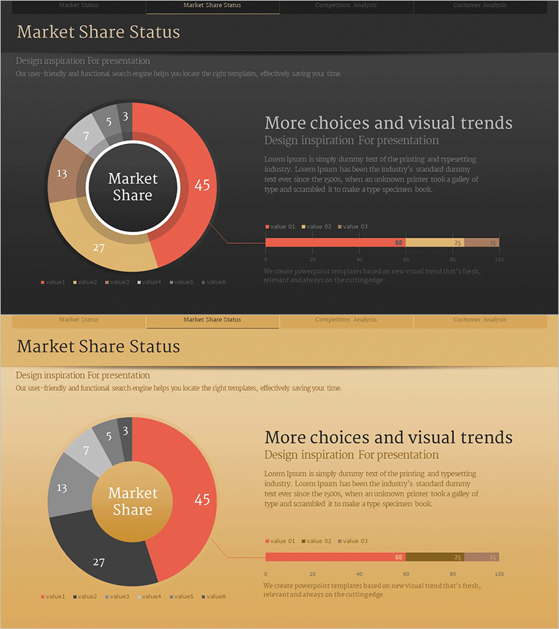
A donut-shaped pie chart PowerPoint slide designed for market share analysis and competitive comparison. The template features a central circular area highlighting key metrics, with an outer ring displaying six data segments in proportional ratios. The color palette combines warm tones (red, yellow, brown) with neutral grays on dark and beige backgrounds, making it ideal for business presentations. The 2-slide set offers flexible background options, and all text, numbers, and colors are fully editable to match your data and branding requirements.
Usage Points
-
Main Usage
Visualizes proportional relationships such as market share, revenue distribution, customer composition, and segment breakdown. The central circular area emphasizes key metrics (e.g., Market Share), while the outer ring clearly displays each segment's value and percentage, making complex data instantly understandable.
-
How to Use
Integrate into business reports, marketing plans, and investor presentations within market analysis sections. Input your data values and the proportions automatically adjust. Customize colors and labels to compare competitors, analyze customer demographics, or present any multi-segment breakdown relevant to your presentation context.
-
Recommended For
Marketing professionals, executives, management consultants, financial analysts, and data-driven decision makers. Particularly effective for market trend analysis, competitive positioning, business performance reporting, and strategic planning presentations.
-
Slide Structure
2-slide set with dark background (charcoal/gray) and beige background options. Each slide contains a central donut chart with 6 segments (red 45%, yellow 27%, brown 13%, gray 7%, 5%, 3%) and a right-side information panel with descriptive text and supplementary horizontal bar graph for comparative data display.
Related Products
-

Doughnut Chart Visualizing Current Status of 3D Printing Technology Development
#Product/Service Introduction #Market and Competitor Analysis #Graph
-

Development Status Analysis Connection Diagram – Effective Information Delivery
#Product/Service Introduction #Market and Competitor Analysis #Diagram
-

Analysis of Transportation Usage Status – Pie Chart
#Product/Service Introduction #Market and Competitor Analysis #Graph
-

Sales Status Analysis Graph – Simple and Stylish Design
#Product/Service Introduction #Market and Competitor Analysis #Graph
