Three-Curve Graph for Market Trend Analysis – Differentiation from Competitors
RJ0500036_9
- Last Update 06/17/2025
- File Size 0.5MB
- # of Slides 2
- File Format PPTX
- Slide Ratio 16:9
- Color
Keywords
About the Product
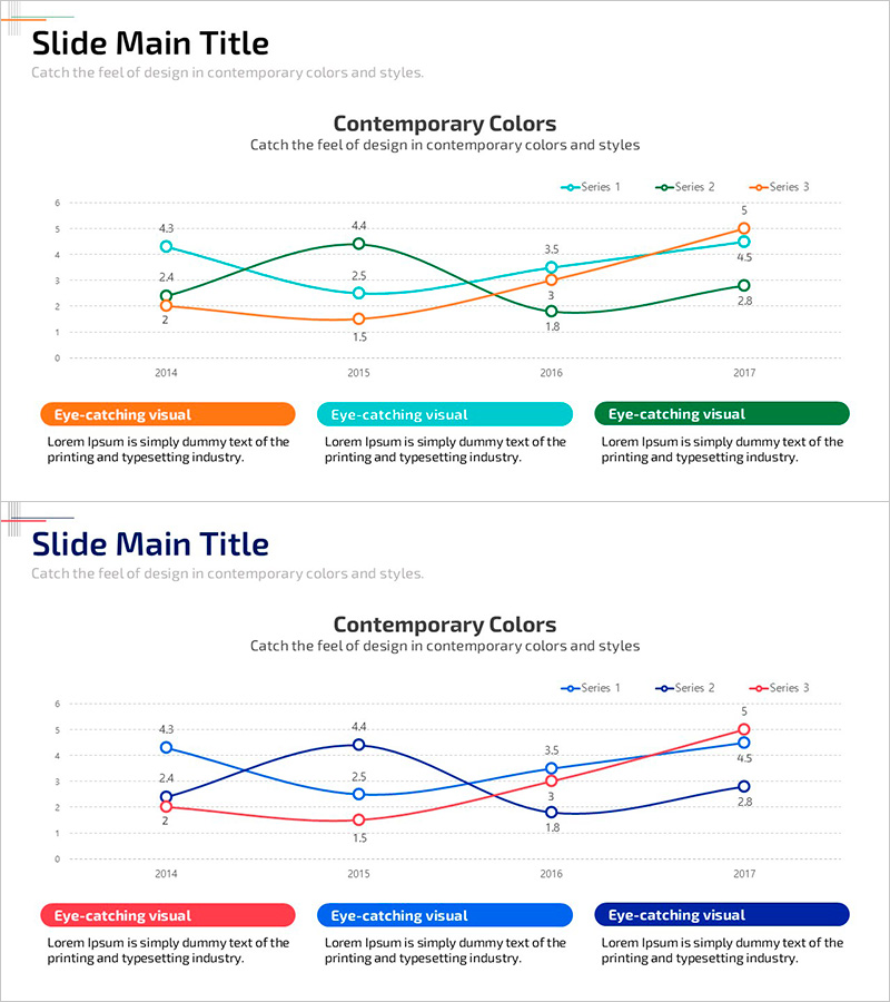
A multi-series line chart PowerPoint slide that visualizes four years of market dynamics from 2014 to 2017 using three distinct data series. The slide features orange, teal, and dark green lines that intersect at key points, clearly showing competitive relationships and trend shifts over time. Each data point is labeled with numerical values for precise comparison and analysis. This presentation slide is ideal for market analysis reports, competitive performance benchmarking, business trend presentations, and investor communications. The chart design supports immediate customization of colors, labels, and background to match your specific data and branding requirements.
Usage Points
-
Main Usage
Compare multiple indicators over time and visualize performance differences across competitors or departments simultaneously. The labeled data points enable accurate numerical communication, while intersection points reveal competitive dynamics and trend reversals at a glance.
-
How to Use
Deploy in business reports' market analysis sections, executive performance presentations, marketing strategy meetings, and investor pitch decks. Edit the series colors and labels to match your data, customize the slide background and fonts, and integrate seamlessly into your presentation workflow.
-
Recommended For
Executives, marketing managers, sales directors, business planners, and financial analysts who rely on quantitative data for decision-making. Particularly effective for quarterly and annual performance comparisons, competitive landscape analysis, and business trend reporting.
-
Slide Structure
Two-slide set featuring a 3-series line graph with data points labeled across 2014-2017. The second slide adds three colored callout boxes (orange, teal, dark green) to annotate each series' meaning. Formatted in 16:9 widescreen ratio for modern presentation environments and full PowerPoint editability.
Related Products
-

Medical Development Data Analysis Graph – Market and Competitor Analysis
#Market and Competitor Analysis #Graph #Competitor Analysis
-

Competitor Analysis Graph for Market Capture
#Market and Competitor Analysis #Graph #Competitor Analysis
-

Data Analysis Graph Visualization for Market Competition
#Market and Competitor Analysis #Diagram #Graph
-

Competitor Technology Comparison Graph – Market and Competitor Analysis
#Market and Competitor Analysis #Graph #Competitor Analysis
