Balance Sheet Comparison Chart – Effective Visualization of Financial Data
RM0100012_31
- Last Update 01/28/2025
- File Size 1.3MB
- # of Slides 2
- File Format PPTX
- Slide Ratio 16:9
- Color
Keywords
- #Content-Based Slides
- #Design-Based Slides
- #Market and Competitor Analysis
- #Financial Plans and Performance
- #Diagram
- #Balance Sheet
- #Income Statement
- #Table
- #16:9
- #balance sheet PPT slide
- #financial comparison chart PowerPoint
- #3-column table slide
- #balance sheet PowerPoint template
- #financial data visualization PPT
About the Product
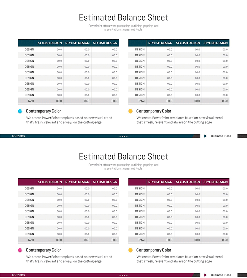
An essential balance sheet slide for financial reports and investor presentations. This 2-slide set provides a layout comparing assets, liabilities, and equity across 3 columns. The dark blue header and white background maximize readability of numerical data, with each row featuring a DESIGN label and 00.0 formatted data entry fields. The table structure is fully editable in PowerPoint, enabling clear visualization of accounting data, financial metrics, and budget comparisons. Ideal for investor pitches, financial analysis, executive briefings, and various business presentation scenarios.
Usage Points
-
Main Usage
A slide for financial reports, investor presentations, and executive briefings that compares balance sheet items across 3 periods or scenarios. The table format allows stakeholders to grasp changes in assets, liabilities, and equity at a glance, and numerical data can be entered for immediate presentation use.
-
How to Use
Enter account item names in each DESIGN row, then input corresponding period amounts in the 3 right columns. Replace the header row 'STYLISH DESIGN' text with period labels (e.g., 2023, 2024, 2025 Forecast) to complete the comparative analysis slide. Colors and fonts can remain as-is or be customized to match your company brand guidelines.
-
Recommended For
CFOs, finance managers, and accounting teams presenting financial status to executives, investors, and boards. Particularly suited for annual financial statement analysis, multi-year trend comparison, budget vs. actual performance analysis, and scenario planning presentations. Also applicable to financial analysis materials in banking, securities, and consulting sectors.
-
Slide Structure
Composed of 2 slides, each containing a title area and one 3-column comparison table. The table consists of a header row (3 STYLISH DESIGN columns) plus 9 data rows, with each cell accepting text and numerical input. The dark blue header and white background create a clear 2-tone information hierarchy.
Related Products
-

Balance Sheet by Business Area Presentation Slide
#Market and Competitor Analysis #Financial Plans and Performance #Diagram
-

Geometry Pattern Wide Table PPT Template for Financial Planning and Performance
#Financial Plans and Performance #Diagram #Balance Sheet
-

Table of Contents for Profit Achievement – Visualizing Financial Plans
#Financial Plans and Performance #Diagram #Balance Sheet
-

Last Year's Sales Comparison Analysis Table – Visually Representing Financial Performance
#Financial Plans and Performance #Diagram #Balance Sheet
