Comparison graph of broken lines by year – Market and Competitor Analysis
RM0100010_13
- Last Update 01/27/2025
- File Size 1MB
- # of Slides 2
- File Format PPTX
- Slide Ratio 16:9
- Color
Keywords
- #Content-Based Slides
- #Design-Based Slides
- #Market and Competitor Analysis
- #Graph
- #Market Status
- #Competitor Analysis
- #Line
- #Line Chart
- #16:9
- #line chart PowerPoint
- #dual-series line graph
- #year-over-year comparison slide
- #market analysis template
- #competitor analysis PowerPoint
- #trend comparison presentation
About the Product
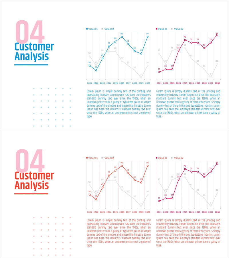
A dual-series line chart PowerPoint slide designed to compare market data and competitor performance across years. Blue and pink lines represent Value01 and Value02, tracking changes from 2021 to 2030 with clear data point markers and gridlines for precise reading. Each slide includes a description text area below the chart for detailed analysis commentary. Ideal for business presentations including market analysis, competitive benchmarking, performance reports, and strategic planning. The template supports immediate customization of data, labels, and color schemes to match your company branding and presentation context.
Usage Points
-
Main Usage
Visualize and compare two key metrics over time, such as market growth rate versus competitor performance or internal KPI versus industry benchmark. The dual-line format enables stakeholders to identify performance gaps, track convergence or divergence patterns, and make data-driven strategic decisions in executive briefings, investor presentations, and board meetings.
-
How to Use
Enter your analysis title in the header area (e.g., Market Share, Customer Satisfaction). Update the legend labels from Value01 and Value02 to your actual metric names. Replace the 2021–2030 year axis and corresponding data points with your dataset. Modify the description text below the chart to include key findings and strategic insights. Adjust line colors and thickness to align with corporate branding guidelines.
-
Recommended For
Marketing managers presenting market analysis and competitive positioning, sales executives benchmarking competitor metrics, finance teams reporting annual performance comparisons, and strategy planners tracking business trajectory. Particularly effective when comparing two related indicators over extended periods and emphasizing trend direction and magnitude of change.
-
Slide Structure
Two-slide layout. Each slide features a section header '04 Customer Analysis' in the upper left, a dual-line chart in the center with blue and pink lines representing two data series (2021–2030), a legend box on the right, and a two-column text description area at the bottom. Grid background and data point markers enable precise value tracking and visual clarity.
Related Products
-

Graph Comparing Transportation Methods – Market Overview Analysis
#Market and Competitor Analysis #Graph #Other
-

Annual Logistics Volume Trend Line Chart
#Market and Competitor Analysis #Graph #Market Status
-

Graph of Usage Patterns by Year – Visualizing Market Conditions through Cluster Slides
#Market and Competitor Analysis #Diagram #Graph
-

Pill Shape Line Graph & Bar Graph – Essential for Market Analysis
#Market and Competitor Analysis #Graph #Text Box
