Comparative Analysis 3D Pie Chart – Market Share Visualization
RM0100010_11
- Last Update 01/27/2025
- File Size 1MB
- # of Slides 2
- File Format PPTX
- Slide Ratio 16:9
- Color
Keywords
- #Content-Based Slides
- #Design-Based Slides
- #Product/Service Introduction
- #Market and Competitor Analysis
- #Graph
- #Development Status
- #Market Share
- #Circles
- #Pie Chart
- #16:9
- #3D pie chart PowerPoint
- #pie graph slide template
- #market share visualization
- #comparative analysis chart
- #dual pie chart slide download
About the Product
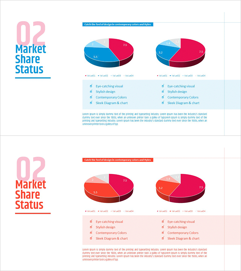
A professional 3D pie chart PowerPoint slide designed for market share analysis and comparative data visualization. Two side-by-side pie charts feature blue and pink color schemes, each divided into four segments to clearly represent different market datasets. The 3D effect and precise numerical labels enhance presentation credibility, making it ideal for marketing reports, sales presentations, competitive analysis, customer demographics, and revenue breakdowns. The 16:9 widescreen format with 2-slide layout adapts seamlessly to any presentation environment and supports quick data customization.
Usage Points
-
Main Usage
Visualize and compare two market datasets simultaneously, such as market share, competitive positioning, customer segments, or product sales ratios. The 3D effect and clear numerical labels capture audience attention while making complex percentage data instantly understandable and actionable.
-
How to Use
Double-click each pie chart segment to edit numerical values and input your actual data. Modify legend text and percentage labels by clicking directly on them. Right-click the chart to access color customization options. The side-by-side layout allows intuitive comparison between left and right datasets without additional formatting.
-
Recommended For
Marketing professionals presenting market analysis, sales teams comparing competitor performance, executives reporting business status, investors evaluating market opportunities, and consulting firms delivering industry insights. Applicable across finance, retail, technology, manufacturing, and all business sectors.
-
Slide Structure
Two 3D pie charts positioned side-by-side at the top, each divided into four segments. Left chart uses blue-dominant palette (light blue, dark blue, pink, gray); right chart uses pink-dominant palette with matching segment colors. Legend and four item labels appear below each chart, with descriptive text area centered at the bottom for additional context.
Related Products
-

Pie Chart for Learning Progress – Optimizing Data Visualization
#Product/Service Introduction #Market and Competitor Analysis #Graph
-

Modern Theme Pie Chart – Market Share Analysis
#Product/Service Introduction #Market and Competitor Analysis #Graph
-

Securities Business Analysis Circle Graph
#Product/Service Introduction #Market and Competitor Analysis #Graph
-

Construction Development Status Chart – Key to Construction Market Analysis
#Product/Service Introduction #Market and Competitor Analysis #Graph
