Market Status Analysis Chart – A Tool for Effective Market Analysis
RM0100007_11
- Last Update 01/26/2025
- File Size 0.5MB
- # of Slides 2
- File Format PPTX
- Slide Ratio 16:9
- Color
Keywords
- #Content-Based Slides
- #Design-Based Slides
- #Product/Service Introduction
- #Market and Competitor Analysis
- #Graph
- #Development Status
- #Market Status
- #Horizontal Bar
- #Circles
- #Segmented Horizontal Bar
- #Pie Chart
- #16:9
- #pie chart PowerPoint slide
- #market share analysis presentation
- #circular graph template
- #business analytics slide
- #market status visualization
About the Product
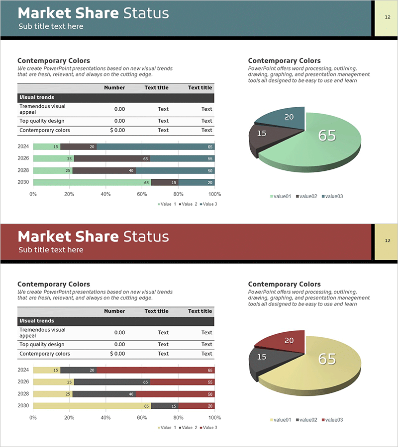
A PowerPoint slide deck featuring pie charts and bar graphs to visualize market share and competitive positioning. The presentation includes two slides with identical layouts in different color schemes—teal, green, and brown accents on the first slide, and red, beige, and dark gray on the second. Each slide combines a three-segment pie chart with a stacked bar chart showing year-over-year trends, alongside an editable data table. The layout integrates numerical data, descriptive text, and visual elements to communicate market analysis comprehensively. Both slides are fully editable and ready for immediate use with your own market data.
Usage Points
-
Main Usage
Illustrate market share distribution, competitor comparison, and customer segment composition using pie charts. The three-segment design emphasizes proportional relationships, while the accompanying stacked bar chart shows trends across multiple years or categories, providing comprehensive market context.
-
How to Use
Insert this slide into business plans, marketing strategy presentations, or quarterly performance reports in the market analysis section. Edit the pie chart segments by clicking on each slice to update values and labels. Modify the bar chart data to reflect actual market figures. Choose between two color themes to match your overall presentation branding.
-
Recommended For
Marketing managers, executives, business analysts, and consultants presenting market conditions. Ideal for investor pitch decks, new market entry proposals, and competitive strategy discussions where clear visualization of market dynamics is essential.
-
Slide Structure
Two slides with identical layouts in different color palettes. Left side features a 4-row, 3-column data table (visual trends, numbers, descriptions). Right side displays a 3-segment pie chart (65%, 20%, 15% distribution) above a stacked horizontal bar chart tracking four years of data across three series.
Related Products
-

Market Entry Potential and Expansion Strategy Chart
#Market and Competitor Analysis #Graph #Market Status
-

Red Green Detail Analysis Chart – Visualizing Market Share
#Market and Competitor Analysis #Graph #Market Status
-

Pie Chart & Bar Graph for Market Analysis – Visualizing Data
#Market and Competitor Analysis #Graph #Market Status
-

Trial Stereo Graph – An Efficient Tool for Market and Competitor Analysis
#Product/Service Introduction #Market and Competitor Analysis #Diagram
