Vanity vs. Crisis Metric Slide – 2-Panel Dark Green & Red
RBTK04000010_5
- Last Update 05/06/2026
- File Size 14.3MB
- # of Slides 2
- File Format PPTX
- Slide Ratio 16:9
- Color
Keywords
- #Design-Based Slides
- #Business Strategy
- #Graph
- #Achievements
- #Column
- #Column Chart
- #Segmented Column
- #Project Progress
- #16:9
- #vanity metrics crisis signal comparison PowerPoint slide
- #SaaS data diagnostic presentation template
- #growth metric analysis slide deck dark theme
- #startup crisis indicator PowerPoint
- #two-panel metric comparison presentation slide
About the Product
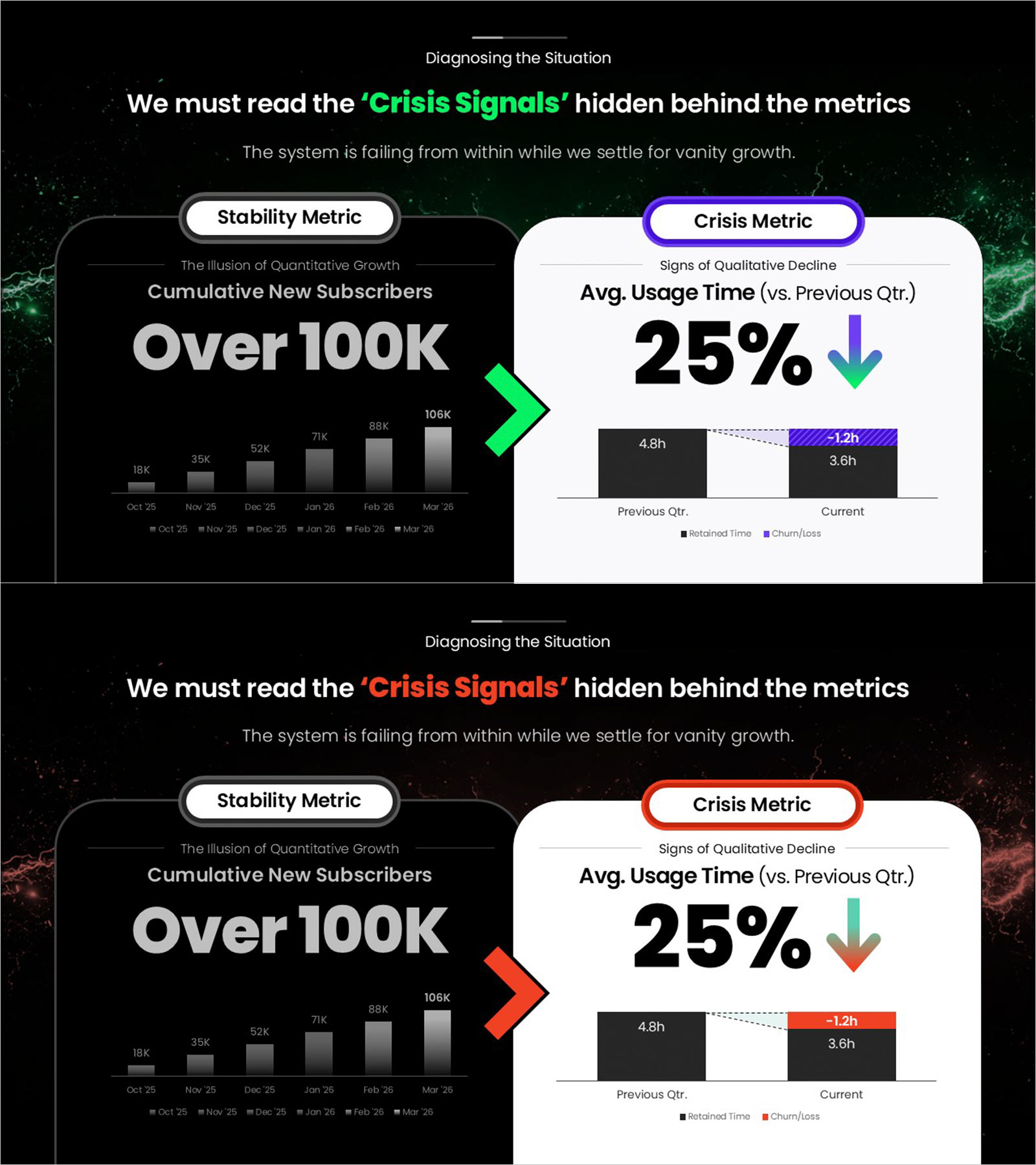
Data diagnostic PowerPoint slide contrasting vanity growth metrics with hidden crisis signals in a two-panel layout. The left dark panel (Stability Metric) shows "The Illusion of Quantitative Growth" — cumulative new subscribers over 100K — with a bar chart from Oct '25 to Mar '26 (18K to 106K). A large center chevron arrow connects to the right light panel (Crisis Metric), which shows "Signs of Qualitative Decline" — average usage time down 25% versus previous quarter (4.8h to 3.6h, -1.2h churn/loss) — with a declining comparison bar chart. Top section label reads "Diagnosing the Situation" with a headline focused on reading crisis signals hidden behind metrics. Dark black background in green-accent and red-orange-accent variants. Editable in PowerPoint for SaaS and startup business reviews, board presentations, and investor pitch decks.
Usage Points
-
Main Usage
Use as the crisis diagnostic section in SaaS and startup investor pitch decks and board decks. Contrasts vanity growth data with hidden churn signals in one PowerPoint slide.
-
How to Use
Replace the left panel metric and chart data with your stability data. Update the crisis indicator, percentage, and comparison chart with your churn data in PowerPoint.
-
Recommended For
Ideal for SaaS and startup founders and IR teams presenting the gap between surface-level growth and actual user engagement to investors and board members.
-
Slide Structure
One slide. Section label and headline. Left: dark stability metric panel with bar chart. Center: chevron arrow. Right: light crisis metric panel. Dark green and red versions.
Related Products
-

Square Frame Presentation Template – Vertical Bar Chart
#Business Strategy #Graph #Achievements
-

Business Promotion Strategy Slide Template – Effective Information Delivery and Visual Composition
#Business Strategy #Graph #Other
-

Green & Gray Template Wide Vertical Bar Chart – Performance Visualization
#Company Introduction #Business Strategy #Graph
-

Fantastic Wide PPT Vertical Bar Segmentation Chart – Visualization of Business Strategy
#Business Introduction #Business Strategy #Graph
