Market Analysis Bar Graph & Table - Data Visualization for Competitive Advantage
RM0100004_10
- Last Update 01/25/2025
- File Size 3.4MB
- # of Slides 2
- File Format PPTX
- Slide Ratio 16:9
- Color
Keywords
- #Content-Based Slides
- #Design-Based Slides
- #Market and Competitor Analysis
- #Diagram
- #Graph
- #Competitor Analysis
- #Market Analysis
- #Table
- #Line
- #Line Chart
- #16:9
- #line chart PowerPoint slide
- #market analysis presentation template
- #trend analysis chart
- #dual-series graph
- #data visualization PPT
- #competitive analysis slides
- #how to create line chart in PowerPoint
About the Product
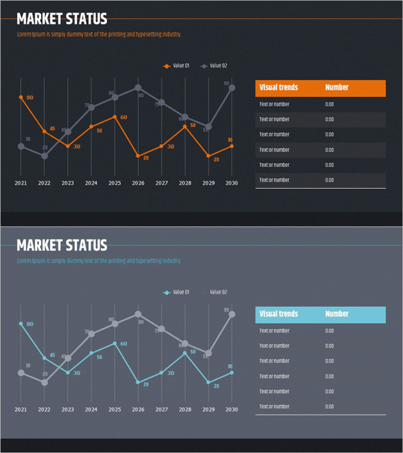
A dual-series line chart PowerPoint slide comparing market trends from 2021 to 2030. Orange and gray line series represent Value 01 and Value 02, with clear data point labels showing exact values at each year interval. The right side features an editable data table for supplementary information. This presentation template is ready to use for market analysis, competitive comparison, revenue trends, and strategic business reporting.
Usage Points
-
Main Usage
Designed to compare long-term market trends across two data series over a decade. The line patterns clearly show direction, velocity, and fluctuations in market movement, enabling precise year-by-year value comparison and trend identification.
-
How to Use
Use in business reports, market analysis presentations, competitive benchmarking, sales performance reviews, and strategic planning discussions. Replace data point values with actual figures and populate the right-side table with key metrics to create a polished presentation.
-
Recommended For
Executives, marketing managers, business strategists, financial analysts, and consultants presenting market conditions, performance reports, and strategic initiatives. Ideal for situations requiring long-term trend analysis and multi-metric comparison.
-
Slide Structure
Two line series (orange and gray), 10-year timeline (2021–2030), labeled data points with numeric values, legend (Value 01 and Value 02), and right-side table (6 rows × 2 columns) for editable information.
Related Products
-

Competitive Market Analysis Graph - Insights for Understanding the Market
#Market and Competitor Analysis #Diagram #Graph
-

Line Chart & Table – Market and Competitor Analysis
#Market and Competitor Analysis #Diagram #Graph
-

Business Competitor Analysis Comparison Graph – Market Status Insight
#Market and Competitor Analysis #Diagram #Graph
-

Sales and Profit Analysis Graph – Market Trends and Forecast
#Market and Competitor Analysis #Diagram #Graph
