Marketing and Analysis Presentation Template – Professional Data Visualization Design
RJ0300057_12
- Last Update 08/30/2025
- File Size 3.1MB
- # of Slides 2
- File Format PPTX
- Slide Ratio 16:9
- Color
Keywords
- #Content-Based Slides
- #Design-Based Slides
- #Market and Competitor Analysis
- #Graph
- #Competitor Analysis
- #Market Analysis
- #Column
- #Grouped Column
- #16:9
- #column chart PowerPoint
- #data comparison slide template
- #marketing analysis presentation
- #year-over-year chart
- #grouped bar graph PowerPoint template
About the Product
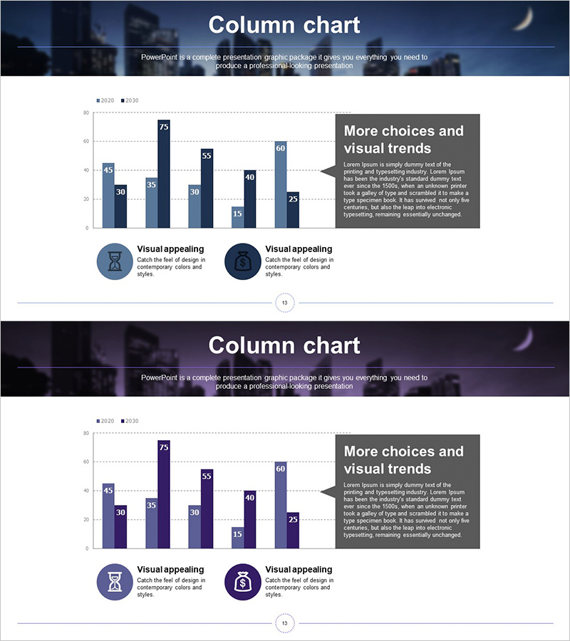
A professional PowerPoint slide set of 2 sheets optimized for marketing analysis and data visualization. Features a grouped column chart comparing numerical data across 2020 and 2030, with values (45, 30, 75, 55, 30, 40, 25, etc.) clearly displayed for each category. The dual-tone color scheme—dark blue and light blue—distinguishes data by year, enabling intuitive comparative analysis. A text box on the right labeled 'More choices and visual trends' provides space for additional insights or explanations. The bottom includes two circular icons with 'Visual appealing' labels to emphasize design elements. Delivered in 16:9 widescreen PPTX format, fully editable and ready to customize with your own data.
Usage Points
-
Main Usage
Visualizes numerical comparisons across years and categories with clarity and impact. Perfect for presenting marketing performance metrics, sales figures, market research results, or any analysis requiring two-point quantitative comparison. The bar heights intuitively convey magnitude differences, while the dual-color scheme clearly distinguishes time periods.
-
How to Use
Open the slide and replace existing values with your own data. Edit bar heights and numeric labels to reflect your analysis results, then populate the right-side text box with key insights or conclusions. Colors and fonts are fully customizable to match your corporate brand. Both slides share the same structure, allowing you to present multiple datasets consistently.
-
Recommended For
Ideal for marketing teams presenting campaign performance analysis, sales departments comparing quarterly results, executive dashboards highlighting key metrics, and consulting proposals requiring data-driven analysis sections. Particularly effective for decision-making presentations and investor reports where quantitative evidence strengthens credibility.
-
Slide Structure
Each slide comprises a title area, a grouped column chart with 7 categories and 2 data series (dark blue for 2020, light blue for 2030), a right-aligned explanatory text box, and bottom-positioned icons with labels. The Y-axis displays a 0–80 scale with gridlines, X-axis shows category labels, and the overall layout balances the chart on the left with supplementary text on the right for clear information hierarchy.
Related Products
-

Infographic Slide Highlighting Visualized Data – Modern Design
#Market and Competitor Analysis #Graph #Competitor Analysis
-

Table chart & Clustered Column Graph – Market Analysis & Competitor Comparison
#Market and Competitor Analysis #Diagram #Graph
-

Performance Analysis Table Slide – Market and Competitor Analysis
#Market and Competitor Analysis #Diagram #Graph
-

Vertical Bar Chart for Future Growth Prediction – Innovative Vision
#Market and Competitor Analysis #Graph #Competitor Analysis
