Infographic Slide Highlighting Visualized Data – Modern Design
RJ0300080_5
- Last Update 05/11/2025
- File Size 0.9MB
- # of Slides 2
- File Format PPTX
- Slide Ratio 16:9
- Color
Keywords
About the Product
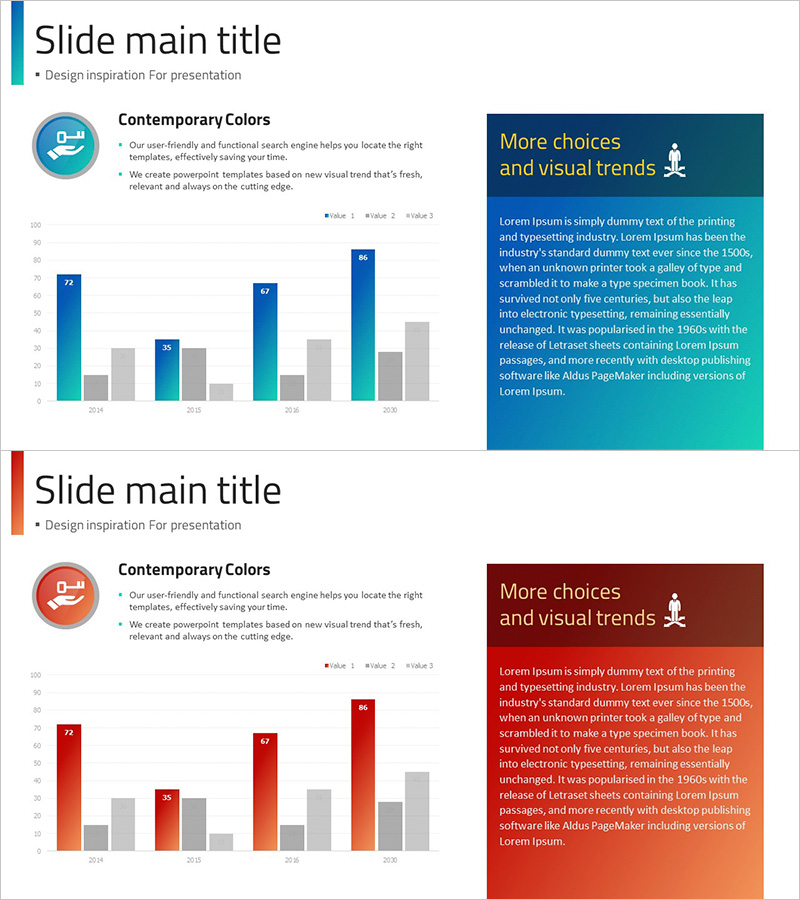
A modern PowerPoint slide featuring a grouped bar chart with contemporary color palette for multi-series data visualization. The slide displays four data series across 2024–2027, enabling year-over-year and item-by-item comparative analysis with clear data labels. Teal, blue, and gray gradient background enhances presentation credibility. Left-side icon and text area introduce the topic, while the right-side information box emphasizes key insights. The two-column layout is ideal for marketing reports, financial presentations, sales performance analysis, and business dashboards comparing revenue, market share, or KPI metrics.
Usage Points
-
Main Usage
Visualize and compare multiple data series across time periods or categories. The grouped bar layout allows audiences to quickly identify differences between items and track trends across four concurrent data streams. Perfect for presenting sales figures, budget allocations, market performance, or departmental metrics in executive briefings.
-
How to Use
Enter topic title and description in the left text area. Input actual data values into the grouped bar chart, adjusting bar heights and labels as needed. Add key findings or conclusions in the right information box to reinforce insights. All colors, fonts, and data labels are fully editable. Duplicate bars to add additional series if required.
-
Recommended For
Marketing teams presenting campaign performance metrics, finance departments reporting quarterly earnings, sales teams comparing regional or product-line revenue, executive leadership reviewing KPI dashboards, and management consultants benchmarking competitive data. Suitable for any data-driven business presentation requiring multi-dimensional comparison.
-
Slide Structure
Two-slide set with identical layout. Each slide contains a circular icon (blue tones) with title and descriptive text on the left, a centered grouped bar chart with 4 data series spanning 2024–2027 (4 data points per series), and a teal information box on the right for text input. 16:9 widescreen format optimized for modern projectors and displays.
Related Products
-

Table chart & Clustered Column Graph – Market Analysis & Competitor Comparison
#Market and Competitor Analysis #Diagram #Graph
-

Performance Analysis Table Slide – Market and Competitor Analysis
#Market and Competitor Analysis #Diagram #Graph
-

Market Analysis Bundle Vertical Bar Graph – Effective Data Visualization
#Market and Competitor Analysis #Graph #Competitor Analysis
-

Line Graph and Clustered Column Graph – Essential for Competitor Analysis
#Market and Competitor Analysis #Graph #Competitor Analysis
