Income Statement Comparison Chart – Visualizing Financial Performance
RJ0400042_10
- Last Update 08/30/2025
- File Size 0.1MB
- # of Slides 2
- File Format PPTX
- Slide Ratio 16:9
- Color
Keywords
About the Product
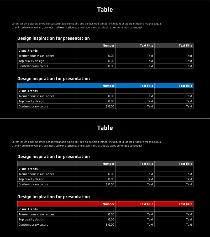
A professional income statement comparison table PowerPoint slide designed for clear financial performance analysis. The slide features a dark background with white text and blue header accents, providing two distinct table layouts across 2 slides. Each slide is optimized for inputting numerical financial data in an intuitive structure, making it ideal for financial reports, investor presentations, and management analysis meetings. The table format enables direct comparison of financial metrics, performance indicators, budget status, and other key financial information with professional visual hierarchy.
Usage Points
-
Main Usage
Present and compare financial performance metrics in a structured table format, enabling clear communication of revenue, expenses, and profit figures to executives, investors, and stakeholders. The slide transforms complex financial data into an easy-to-read visual format that supports data-driven decision making.
-
How to Use
Use in investor relations materials, financial reports, quarterly earnings presentations, and annual performance reviews. Input financial figures such as revenue, cost of goods sold, operating expenses, and net income into the table cells. The blue header row highlights key financial categories, improving data readability and audience comprehension.
-
Recommended For
CFOs, financial analysts, corporate executives, investor relations managers, management consultants, and finance teams presenting quarterly results, annual reports, merger and acquisition discussions, and bank loan applications. Ideal for any presentation requiring financial credibility and data transparency.
-
Slide Structure
Two slides with 3-4 column and 3-4 row table structures. First slide features gray header row; second slide features blue header row for visual variety. All cells support text and numerical input, allowing flexible adaptation to different financial metrics and comparison scenarios.
Related Products
-

Transportation Business Sales and Profit Table – Financial Analysis
#Financial Plans and Performance #Diagram #Income Statement
-

Profit and Loss Statement Slide – Calculating Investment Business Sales and Profits
#Financial Plans and Performance #Diagram #Income Statement
-

Illustration Theme Income Statement Table – A Fresh Perspective on Financial Data
#Financial Plans and Performance #Diagram #Income Statement
-

Sales and Profit Table Diagram
#Financial Plans and Performance #Diagram #Income Statement
