Outstanding Equipment Donut Chart – An Easy Tool for Performance Analysis
RJ0900032_6
- Last Update 08/30/2025
- File Size 1.4MB
- # of Slides 2
- File Format PPTX
- Slide Ratio 16:9
- Color
Keywords
About the Product
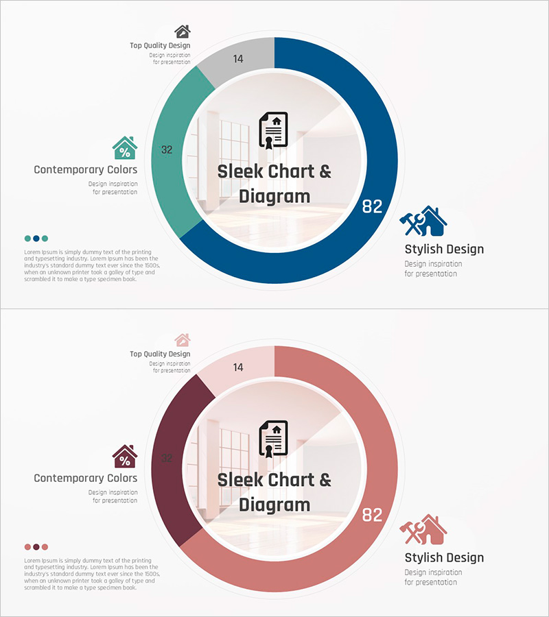
A donut chart PowerPoint slide that visually represents the ratio of three data segments. Designed with navy blue and wine red color scheme, featuring a central circular area for key messaging. Each segment can be customized with numerical values and labels to display financial performance, departmental contribution, customer satisfaction, or market share data. Consists of 2 slides optimized for 16:9 widescreen format. Fully editable PPTX template ready for immediate use in presentations and reports.
Usage Points
-
Main Usage
Displays the proportional relationship of three data categories in a circular format for instant comprehension. The central circular area accommodates titles, totals, or key messages for visual emphasis. Perfect for financial performance reporting, departmental contribution analysis, customer satisfaction metrics, and market share visualization.
-
How to Use
Input numerical values and labels into each donut segment to update data. Add titles, totals, or key messages in the central circular area. Color segments automatically distinguish data categories; customize the color palette as needed. Use both slides for comparative analysis or to show changes over time periods.
-
Recommended For
Recommended for finance team performance reports, marketing market analysis presentations, executive dashboard briefings, and quarterly or annual performance reviews. Effective for consulting reports, business proposals, and investor pitch decks to enhance data credibility.
-
Slide Structure
2-slide set, each containing one 3-segment donut chart. Segments are color-coded in navy blue, wine red, and gray tones. The central circular area features a white background for text input. A legend area on the left displays category names and numerical values.
Related Products
-

Market Sales by Tea Type – Highlighting Key Performance
#Company Introduction #Financial Plans and Performance #Graph
-

Cafe Business Initial Investment and Financial Strategy - Path to Success
#Financial Plans and Performance #Graph #Sales and Revenue
-

Visualizing Real Estate Sales Composition with Doughnut Chart – A Tool for Management Analysis
#Market and Competitor Analysis #Financial Plans and Performance #Graph
-

Shareholder Status Donut Chart – Visualizing Financial Performance
#Company Introduction #Financial Plans and Performance #Graph
