Shareholder Status Donut Chart – Visualizing Financial Performance
RJ0900010_6
- Last Update 08/18/2025
- File Size 0.4MB
- # of Slides 2
- File Format PPTX
- Slide Ratio 16:9
- Color
Keywords
- #Content-Based Slides
- #Design-Based Slides
- #Company Introduction
- #Financial Plans and Performance
- #Graph
- #Shareholder Structure
- #Sales and Revenue
- #Circles
- #Doughnut Chart
- #16:9
- #donut chart PowerPoint
- #pie chart slide template
- #financial visualization presentation
- #shareholder composition chart
- #percentage data PPT
- #4-section donut graph
About the Product
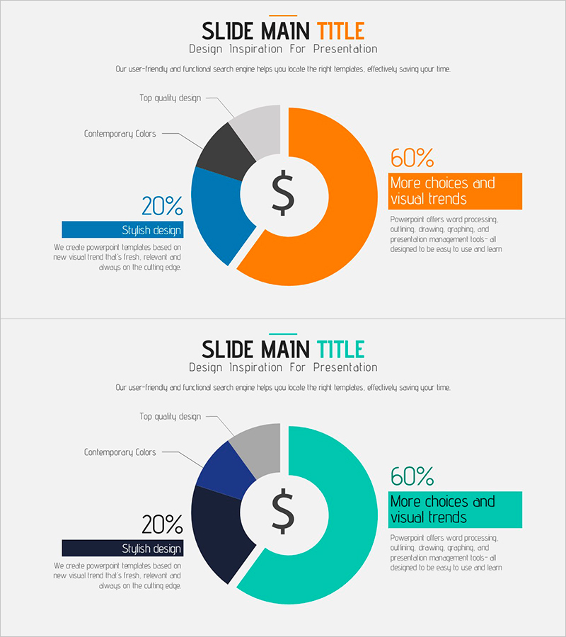
A professional donut chart PowerPoint slide designed to visualize shareholder composition and financial performance at a glance. The four-section donut graph uses a multi-color palette of orange, blue, gray, and black to clearly represent proportional relationships, with a dollar symbol at the center emphasizing financial data importance. The 2-slide set offers varied color combinations to match your presentation tone, while percentage values and descriptive text are strategically positioned to enhance audience comprehension. Optimized for 16:9 widescreen format, this template delivers a contemporary presentation experience suitable for investor relations and financial reporting.
Usage Points
-
Main Usage
Visualizes proportional relationships across four categories such as shareholder composition, asset allocation, revenue breakdown, or market segments using a donut chart format. The central emphasis area combined with outer segmented sections enables hierarchical information delivery, making it ideal for financial reports, investor presentations, and executive performance analyses.
-
How to Use
Simply replace the percentage values and labels with your actual data for immediate use. Two color scheme versions are provided—select the combination that best matches your presentation theme and corporate branding. All text boxes and chart elements are fully editable, allowing you to add additional notes, annotations, or custom descriptions as needed.
-
Recommended For
Finance professionals, CFOs, and investor relations managers presenting quarterly or annual financial updates will find this template particularly valuable. It's also well-suited for board reports, shareholder meeting materials, business performance presentations, and consulting proposals that require quantitative data visualization.
-
Slide Structure
The 2-slide set features a centered circular area with a four-section donut graph on each slide. The first slide uses an orange, blue, gray, and black color scheme, while the second employs teal, navy, gray, and black for color variety. Each section includes percentage values, labels, and descriptive text positioned to support data interpretation and audience engagement.
Related Products
-

Visualizing Real Estate Sales Composition with Doughnut Chart – A Tool for Management Analysis
#Market and Competitor Analysis #Financial Plans and Performance #Graph
-

Market Sales by Tea Type – Highlighting Key Performance
#Company Introduction #Financial Plans and Performance #Graph
-

Visualize Coffee Sales Status with Donut Chart – Market Analysis
#Market and Competitor Analysis #Financial Plans and Performance #Graph
-

Visualizing Board Members and Shareholders with a Sleek Diagram
#Company Introduction #Market and Competitor Analysis #Diagram
