Market Sales by Tea Type – Highlighting Key Performance
RJ0800032_28
- Last Update 08/09/2025
- File Size 3.6MB
- # of Slides 2
- File Format PPTX
- Slide Ratio 16:9
- Color
Keywords
- #Content-Based Slides
- #Design-Based Slides
- #Company Introduction
- #Financial Plans and Performance
- #Graph
- #Key Achievements
- #Sales and Revenue
- #Circles
- #Doughnut Chart
- #16:9
- #donut chart PowerPoint
- #pie chart slide template
- #3-segment ratio chart
- #market sales visualization PPT
- #data comparison chart download
About the Product
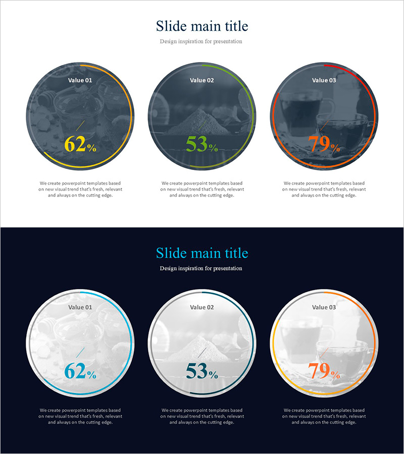
A PowerPoint slide featuring three donut charts that visualize market sales data across three categories. Set against a dark slate background, each circular chart is outlined in yellow, green, and orange, with percentage values (62%, 53%, 79%) prominently displayed in the center. The 2-slide set includes both light and dark background versions, allowing you to match your presentation's tone. Each chart includes a text area below for category descriptions, making it ideal for comparing sales by tea type, region, season, or customer segment. Delivered in 16:9 widescreen PPTX format, fully editable and ready to customize with your own data.
Usage Points
-
Main Usage
This slide is optimized for comparing three data categories side-by-side using donut chart visualization. The hollow center of each donut allows you to place key metrics or titles, while percentage values are clearly emphasized. Perfect for displaying sales by product type, regional performance, seasonal trends, or customer demographics in a single, easy-to-understand layout.
-
How to Use
Customize each donut chart by updating the colors, percentages, and labels to match your data. Use the light background version for projector presentations and printed materials, and the dark version for online presentations or large-screen displays. Add descriptive text in the area below each chart to provide context and analysis for your audience.
-
Recommended For
Ideal for marketing, sales, and executive reports presenting market share, product revenue, or regional performance. Suitable for business plans, quarterly earnings reports, investor presentations, and competitive analysis slides. Applicable across industries—beverages, retail, distribution, technology, and more—for any ratio-based comparison analysis.
-
Slide Structure
Two-slide set with light background (light gray) on slide 1 and dark background (dark navy) on slide 2. Both slides feature three donut charts arranged horizontally, each outlined in yellow, green, and orange. Percentage values are displayed prominently in the center of each donut. A text description area below each chart accommodates category names and analytical insights.
Related Products
-

Sea Lighthouse History Donut Chart – Visualizing Maritime Business Achievements
#Company Introduction #Graph #History
-

Visualization of Traditional Items Proportion – Market Share Analysis
#Company Introduction #Market and Competitor Analysis #Graph
-

Abstract Pattern Doughnut Chart for Sales Analysis – Emphasizing Financial Performance
#Financial Plans and Performance #Diagram #Graph
-

Conservation Donut Chart – Visualization of Sustainability
#Company Introduction #Market and Competitor Analysis #Diagram
