Real Estate Market Forecast Graph – Essential Tool for Market Analysis
RJ0900026_24
- Last Update 08/30/2025
- File Size 0.5MB
- # of Slides 2
- File Format PPTX
- Slide Ratio 16:9
- Color
Keywords
- #Content-Based Slides
- #Design-Based Slides
- #Market and Competitor Analysis
- #Graph
- #Market Analysis
- #Competitive Advantage
- #Column
- #Grouped Column
- #16:9
- #grouped bar chart PowerPoint
- #market analysis slide template
- #real estate data visualization
- #2-series comparison chart
- #how to create grouped bar chart in PowerPoint
About the Product
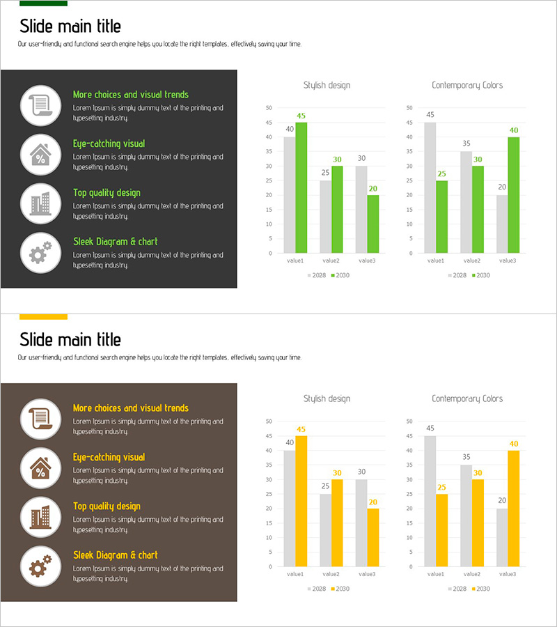
A grouped bar chart PowerPoint slide designed to visualize real estate market forecasts and comparative analysis. This slide combines horizontal and vertical bar charts to display market data across two years simultaneously, enabling clear year-over-year comparison. The contrasting green and orange color scheme distinctly separates data series, while numeric labels on each bar ensure precise data communication. Formatted in 16:9 widescreen ratio with 2 slides, all elements are fully editable in PowerPoint for immediate presentation use.
Usage Points
-
Main Usage
Presents year-over-year real estate market performance, regional market size comparisons, and market trend forecasts. The side-by-side arrangement of two data series facilitates comparative analysis and provides essential visual representation for market insights.
-
How to Use
Input your actual market data directly into the slide for immediate use. Bar heights and colors adjust automatically, and clicking numeric labels allows real-time value updates with instant graph recalculation. Customize titles and legends to match your presentation context.
-
Recommended For
Ideal for real estate company market analysis reports, investor presentations, regional development project proposals, and real estate consulting presentations. Recommended for finance teams, marketing departments, and sales teams delivering data-driven presentations.
-
Slide Structure
2-slide set featuring both horizontal and vertical bar charts on each slide for multi-perspective data representation. Two data series distinguished by green (2028) and orange (2030) colors. Numeric labels (40, 45, 30, 25, 20, etc.) displayed on each bar segment for precise data communication.
Related Products
-

Market Competition and Analysis Graphs – Enhance Business Advantage
#Market and Competitor Analysis #Graph #Other
-

Bundled Bar Chart by Subject – Visualizing Competitive Advantages
#Market and Competitor Analysis #Graph #Market Analysis
-

Layout Design Presentation Template for Market & Competitor Analysis – Column Chart
#Market and Competitor Analysis #Graph #Customer Analysis
-

High Quality Gradient Bar Graph – Market and Competitor Analysis
#Market and Competitor Analysis #Graph #Market Analysis
