Graph of Weight Change by Diet – A Journey of Health Management
RJ0800044_27
- Last Update 08/29/2025
- File Size 0.2MB
- # of Slides 2
- File Format PPTX
- Slide Ratio 16:9
- Color
Keywords
About the Product
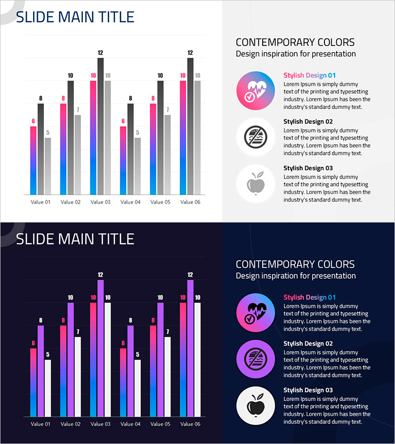
A grouped bar chart PowerPoint slide template designed to track weight changes across different diets. This slide effectively compares numerical data across 6 items (Value 01 through Value 06) with 3 data series simultaneously, using distinct color coding in pink, purple, and blue tones. The template includes 2 versions: a light background variant for standard presentations and a dark background variant for premium or video-based presentations. The right side features a 'Contemporary Colors' design inspiration section with style guidelines. Ideal for health management presentations, diet tracking reports, performance comparisons, and data visualization in business or medical contexts.
Usage Points
-
Main Usage
Designed to compare multiple data series across several categories simultaneously. Ideal for presenting diet-based weight changes, monthly sales comparisons, departmental performance metrics, or any scenario requiring side-by-side analysis of 2 or more data sets.
-
How to Use
Bar heights and colors represent data values. Use the light background version for standard meetings and educational materials, and the dark background version for premium presentations or video backgrounds. Customize colors using the color palette guide on the right side to match your brand identity.
-
Recommended For
Health coaches and fitness professionals, nutritionists and medical consultants, marketing teams analyzing multi-channel performance, financial analysts presenting quarterly or departmental comparisons, academic researchers visualizing experimental data.
-
Slide Structure
2-slide template. Each slide features a grouped bar chart on the left displaying 6 items with 3 color-coded data series, and a design inspiration panel on the right with 3 circular icons and descriptive text. Light version uses black, pink, gray, and blue; dark version uses pink, purple, blue, and white color schemes.
Related Products
-

Chart of Change in Sales by Country – Market Analysis and Competitive Advantage
#Market and Competitor Analysis #Graph #Other
-

Growth Rate Comparison Graph – Optimized for Market Analysis
#Market and Competitor Analysis #Diagram #Graph
-

Flowering Period Graph – Future Outlook Analysis
#Market and Competitor Analysis #Graph #Future Outlook
-

Trial PowerPoint Bundled Graph – Competitive Advantage Analysis
#Market and Competitor Analysis #Graph #Competitive Advantage
