Bilinear Bar Graph Analysis by Scientific Field - A New Paradigm in Data Visualization
RJ0400019_6
- Last Update 05/22/2025
- File Size 0.4MB
- # of Slides 2
- File Format PPTX
- Slide Ratio 16:9
- Color
Keywords
- #Content-Based Slides
- #Design-Based Slides
- #Market and Competitor Analysis
- #Graph
- #Competitor Analysis
- #Market Analysis
- #Horizontal Bar
- #Double Horizontal Bar
- #16:9
- #bilinear bar chart PowerPoint
- #bidirectional bar graph template
- #data comparison slide
- #competitive analysis chart
- #market analysis PowerPoint template download
About the Product
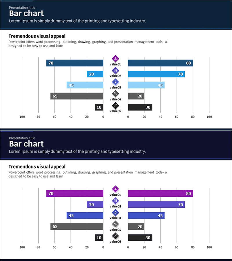
A bidirectional bar chart PowerPoint slide that enables side-by-side comparison of contrasting datasets at a glance. Five data items are displayed in mirror-image format using five color series: dark blue, light blue, purple, gray, and black. Optimized for quantitative data visualization in market analysis, competitive benchmarking, and performance comparison presentations. Delivered as 2 slides in 16:9 widescreen format, ready for immediate editing and deployment.
Usage Points
-
Main Usage
The symmetrical bilinear structure enables simultaneous comparison of two contrasting data groups. Highly effective for competitive performance benchmarking, market share comparison, and positive-negative evaluation contrasts.
-
How to Use
Insert into market analysis and competitive analysis sections to juxtapose performance metrics between two companies, products, or regions. Use in investor pitch decks, business plans, and marketing strategy presentations to visually substantiate decision-making rationale.
-
Recommended For
Recommended for executives, marketing professionals, sales teams, consultants, and analysts requiring data-driven decision support. Suitable for corporate reports, proposals, and strategic presentations.
-
Slide Structure
Left-side bars (70, 20, 45, 65, 10) and right-side bars (80, 70, 45, 20, 30) are symmetrically arranged around a central axis. Five data items (value01–value05) are marked with color-coded icons, and each bar includes numeric labels. Two color theme variants provided (dark tone and purple tone).
Related Products
-

Snow Mountain Theme Double Bar Graph – A Tool for Visualizing Market Analysis
#Market and Competitor Analysis #Graph #Competitor Analysis
-

Visualizing Market and Competitor Analysis with Bilinear Bar Graph
#Market and Competitor Analysis #Graph #Competitor Analysis
-

Competitor Analysis Double Bar Graph
#Market and Competitor Analysis #Graph #Competitor Analysis
-

Technology Services Competitor Analysis and Advantage – Horizontal Bar Chart Slide
#Market and Competitor Analysis #Graph #Competitor Analysis
