Table chart & Clustered Column Graph – Market Analysis & Competitor Comparison
RJ0700006_22
- Last Update 08/29/2025
- File Size 1.8MB
- # of Slides 2
- File Format PPTX
- Slide Ratio 16:9
- Color
Keywords
- #Content-Based Slides
- #Design-Based Slides
- #Market and Competitor Analysis
- #Diagram
- #Graph
- #Competitor Analysis
- #Market Analysis
- #Table
- #Column
- #Grouped Column
- #16:9
- #table chart PowerPoint
- #clustered column graph
- #market analysis slide
- #competitor comparison presentation
- #multi-series data visualization PPT
About the Product
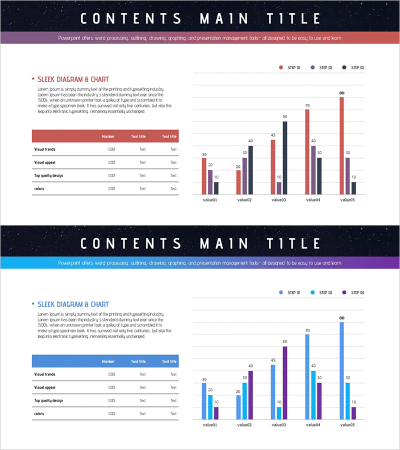
A PowerPoint slide combining a data table and clustered column graph for market analysis and competitor comparison. The left table features a 4-row, 3-column structure organizing key metrics, while the right graph displays 5 data series (red, black, purple, blue, gray) across 5 categories (value01 to value05) for intuitive multi-series comparison. Presented in 16:9 aspect ratio across 2 slides, fully editable for immediate presentation use.
Usage Points
-
Main Usage
Presents multi-series data simultaneously for market analysis, competitive benchmarking, and sales performance reviews. The table provides precise numerical values while the graph enables visual comparison, enhancing audience comprehension and decision-making.
-
How to Use
Enter item names and values in the left table, then modify the graph data series to reflect your analysis results. The 5 color-coded series can be assigned to different companies, products, or regions, with legend labels (STEP 01, STEP 02, STEP 03) clearly identifying each series.
-
Recommended For
Marketing managers, sales directors, executives preparing performance reports, management consultants, and research analysts presenting market conditions, competitive analysis, and comparative performance metrics.
-
Slide Structure
Slide 1: Header (CONTENTS MAIN TITLE) + table (4 rows, 3 columns with highlighted header) + 5-series clustered column graph (5 categories, 3-item legend). Slide 2: Identical layout in blue color variant. Total 2 slides.
Related Products
-

3D Printing Market Analysis Graph
#Market and Competitor Analysis #Diagram #Graph
-

Performance Analysis Table Slide – Market and Competitor Analysis
#Market and Competitor Analysis #Diagram #Graph
-

Paper Theme Table Chart & Bar Graph – Market Analysis and Competitive Strength
#Market and Competitor Analysis #Diagram #Graph
-

Table Chart & Clustered Column Graph – Market and Competitor Analysis
#Market and Competitor Analysis #Diagram #Graph
