Blue Green Progress Visualization – Graph for Achievement Rate
RJ0600088_19
- Last Update 08/28/2025
- File Size 0.3MB
- # of Slides 2
- File Format PPTX
- Slide Ratio 16:9
- Color
Keywords
- #Design-Based Slides
- #Product/Service Introduction
- #Business Strategy
- #Market and Competitor Analysis
- #Graph
- #Development Status
- #Achievements
- #Competitor Analysis
- #Market Share
- #Circles
- #Doughnut Chart
- #16:9
- #donut chart PowerPoint
- #pie chart slide template
- #progress visualization PPT
- #ratio display slide
- #achievement rate graph
- #how to create donut chart in PowerPoint
About the Product
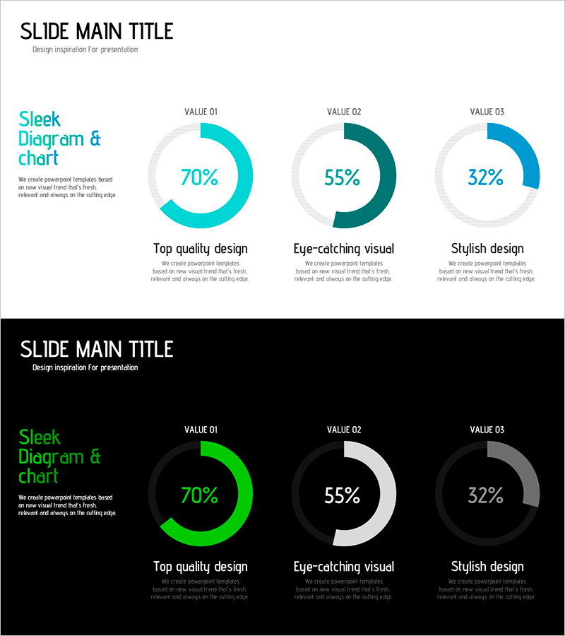
A PowerPoint slide featuring three donut-shaped pie charts that simultaneously display multiple performance metrics. The charts use cyan, dark teal, and blue color gradients to visually represent specific percentages such as 70%, 55%, and 32%. Two layout variations are included—one with a light gray background and another with a dark background—allowing you to choose based on your presentation environment. Each chart includes label and description text areas below, making it ideal for communicating achievement rates, goal completion percentages, satisfaction scores, and other ratio-based data. The 16:9 widescreen format contains 2 slides ready for immediate editing and use.
Usage Points
-
Main Usage
Optimized for presenting three key performance indicators (KPIs) simultaneously while maintaining visual consistency through a unified color palette. Each donut chart represents an independent metric, enabling side-by-side comparison of multiple achievement rates. Ideal for executive reports, business performance presentations, quarterly results analysis, and strategic reviews where multiple metrics need to be communicated at a glance.
-
How to Use
Adjust the fill ratio of each donut chart to match your actual data, then edit the labels and description text below accordingly. Use the light background slide for internal meetings and weekly briefings, and the dark background slide for external presentations or projection environments where contrast is critical. Maintain the color scheme while updating only the percentages and labels to repurpose the slide for different performance metrics.
-
Recommended For
Executives, managers, and project leaders presenting regular reports and performance updates will find this slide particularly useful. Marketing teams can use it to compare campaign performance rates, sales teams for goal achievement analysis, and HR departments for sharing organizational metrics. Finance, strategy, and operations departments can leverage it for quarterly and annual performance presentations.
-
Slide Structure
Consists of 2 slides, each displaying 3 donut-shaped pie charts arranged horizontally. The first slide features a light gray background with cyan (70%), dark teal (55%), and blue (32%) fill colors. The second slide uses a black background with lime green, white, and gray fills in the same layout. Each chart includes a 'VALUE 01–03' label at the top, percentage numerals in the center, and title and description text areas below for customization.
Related Products
-

Development Status Analysis Comparison Graph – Market Share & Growth
#Product/Service Introduction #Market and Competitor Analysis #Graph
-

Tricolor Media Usage Graph for Market Share Analysis – Successful Business Strategy
#Business Strategy #Market and Competitor Analysis #Graph
-

Map Donut Graph for Visualizing Market Share – Symbol of Practicality and Change
#Product/Service Introduction #Market and Competitor Analysis #Graph
-

Charge Shape Circle Graph for Visualizing Data Analysis – Effective Market and Competitor Analysis
#Product/Service Introduction #Market and Competitor Analysis #Graph
