Graph of the Effects of Harmony on a Child – Understanding Customers
RJ0500039_13
- Last Update 08/27/2025
- File Size 0.7MB
- # of Slides 2
- File Format PPTX
- Slide Ratio 16:9
- Color
Keywords
- #Content-Based Slides
- #Design-Based Slides
- #Market and Competitor Analysis
- #Graph
- #Other
- #Customer Analysis
- #Competitor Analysis
- #Horizontal Bar
- #Grouped Horizontal Bar
- #16:9
- #grouped bar chart PowerPoint
- #horizontal bar graph slide template
- #2-series comparison chart
- #5-year trend analysis PPT
- #data visualization presentation slide
About the Product
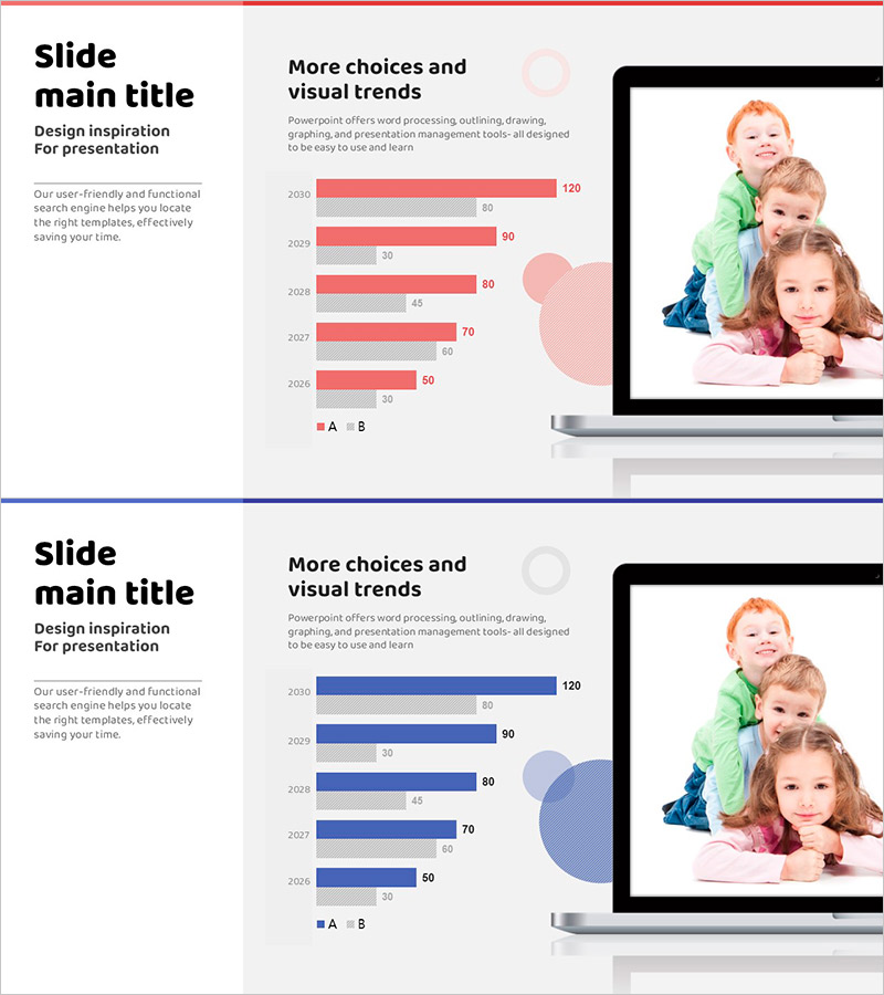
A grouped horizontal bar chart PowerPoint slide template designed to compare two data series across a 5-year period. The slide features a pink and gray dual-tone color scheme, enabling clear side-by-side comparison of Series A and B values for each year. Provided in 16:9 widescreen format with 2 slides, this template is ready for immediate use in visualizing customer satisfaction, market share, performance metrics, and other business analytics. Numerical labels on each bar ensure precise data communication, while the right-side image area accommodates related photos or illustrations, offering flexible layout customization for your presentation context.
Usage Points
-
Main Usage
Ideal for comparing two data categories across multiple years—such as annual performance, customer satisfaction scores, or market share trends. The grouped bar layout enables direct visual comparison between Series A and B at each time point, making quantitative differences immediately apparent to your audience.
-
How to Use
Insert this slide into executive reports, quarterly performance reviews, customer analysis presentations, and competitive benchmarking decks. Simply replace the numerical values with your actual data, and customize the right-side image area with relevant photos or icons to match your presentation narrative and branding.
-
Recommended For
Marketing, sales, and planning teams presenting quarterly or annual performance results, financial analysis reports, customer satisfaction survey findings, and competitive analysis. Particularly effective for executive presentations, investor pitches, and client-facing reports where credible data visualization is essential.
-
Slide Structure
The slide displays 2 data series (A and B) across 5 years (2006–2010) using grouped horizontal bars. Each year shows two bars side by side for direct comparison, with numerical labels positioned at the bar ends. The layout divides the slide into a left text area and a right image area, providing balanced visual composition.
Related Products
-

Gender Ratio Analysis Graph Chart – Data Visualization and Customer Insights
#Market and Competitor Analysis #Graph #Other
-

Future Outlook Analysis Graph – Market and Competitive Analysis
#Market and Competitor Analysis #Graph #Other
-

Bar Graph Visualizing Elderly Population Ratio
#Market and Competitor Analysis #Graph #Other
-

PC Mockup and Target Settings – Market Analysis & Strategy
#Market and Competitor Analysis #Marketing Plan and Strategy #Other
