Hot Air Balloon Ship Illustration Mixed Graph – Market Status Visualization
RJ0500013_12
- Last Update 08/27/2025
- File Size 5.7MB
- # of Slides 2
- File Format PPTX
- Slide Ratio 16:9
- Color
Keywords
About the Product
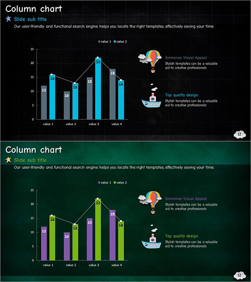
A 2-slide PowerPoint set featuring mixed chart layouts for market analysis and competitive comparison. The slides combine column and line graphs on dark navy and forest green backgrounds, with gray, blue, green, and purple bars representing four data points across two value series. Hot air balloon and ship illustrations with annotation areas are positioned on the right side to support data storytelling. Each slide includes title, subtitle, and explanation text fields for immediate customization. Ideal for business presentations, market reports, competitive analysis, and performance reviews.
Usage Points
-
Main Usage
Visualize market trends, competitive positioning, and performance metrics using combined column and line charts. The dual-axis approach enables simultaneous comparison of absolute values and trends, while the right-side annotation area highlights key insights and strategic recommendations.
-
How to Use
Input actual data into the four data point fields to auto-update the charts. Add analysis findings, strategic implications, or recommendations in the text box next to the illustrations. Choose between navy or forest green background to match your presentation theme. All elements are fully editable in PowerPoint.
-
Recommended For
Executive presentations on market conditions, sales team competitive analysis, marketing department trend reports, consulting firm strategy proposals, startup investor pitch decks, and any data-driven business presentation requiring visual comparison of multiple metrics.
-
Slide Structure
Each slide contains a title and subtitle area, a left-aligned mixed chart with four data categories and two value series, and a right-side illustration with explanation text box. Chart legends, axis labels, and data values are clearly displayed. Three editable text fields (title, subtitle, explanation) enable quick customization.
Related Products
-

Backpacking Traveler Trends Analysis Graph – Future of Travel Industry
#Technical Approach #Market and Competitor Analysis #Graph
-

Graph Trend by Instrument Session – Competitive Analysis Visualization
#Market and Competitor Analysis #Graph #Other
-

Market Analysis Donut Slide for Restaurant Tour Countries
#Market and Competitor Analysis #Graph #Other
-

Graph Comparing Transportation Methods – Market Overview Analysis
#Market and Competitor Analysis #Graph #Other
