Comparative Bar Chart for Data Visualization – Modern Blue and Red
RJ0900032_24
- Last Update 08/26/2025
- File Size 0.4MB
- # of Slides 2
- File Format PPTX
- Slide Ratio 16:9
- Color
Keywords
About the Product
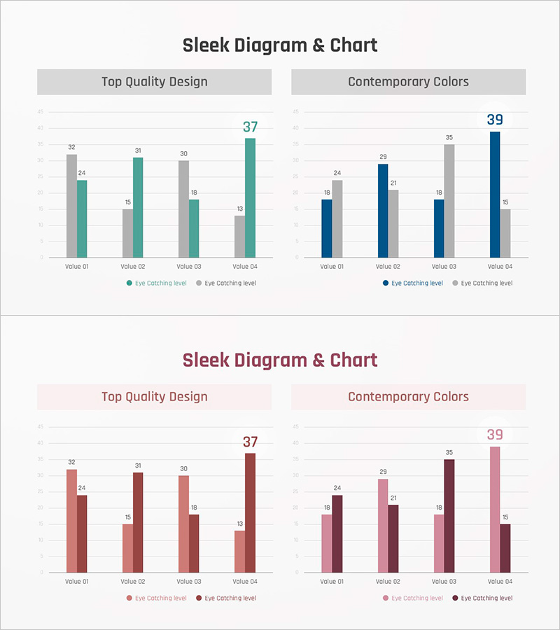
A grouped horizontal bar chart PowerPoint slide that compares two data series across four items side by side. The chart uses contrasting color palettes—gray with teal, or burgundy with pink—to clearly distinguish between the two datasets. Numerical labels are displayed on each bar for precise value reference, making it ready for immediate use in presentations and reports. The 2-slide set offers multiple color themes so you can select the one that matches your presentation tone. This slide is optimized for quantitative data analysis such as marketing performance, departmental results, competitive benchmarking, and quarterly trends in business presentations.
Usage Points
-
Main Usage
Compare two or more data series across multiple items to identify differences and trends at a glance. Ideal for marketing campaign performance (target vs. actual), departmental sales comparison, competitive benchmarking, quarterly performance analysis, and other quantitative business analysis presentations.
-
How to Use
Open the slide and input your data values; the bar lengths adjust automatically. Modify item names and legend labels to match your presentation context, then insert into your report or presentation deck. Two color themes are provided—select the one that aligns with your company branding or presentation tone.
-
Recommended For
Recommended for marketing, sales, and planning professionals presenting performance reports, financial analysis presentations, executive briefings, business proposals, market research findings, and academic presentations. Suitable for any presentation scenario requiring objective comparison and analysis of quantitative data.
-
Slide Structure
Each slide displays four items (Value 01–04) on the horizontal axis and two data series (gray/teal or burgundy/pink) represented as grouped bars. Numerical labels appear on each bar for precise value verification, and a legend at the bottom clearly distinguishes the two series. The 16:9 widescreen format is optimized for contemporary presentation environments.
Related Products
-

Market Analysis Bundle Vertical Bar Graph – Effective Data Visualization
#Market and Competitor Analysis #Graph #Competitor Analysis
-

Business Analysis Graph Slide - Market and Competitor Analysis
#Market and Competitor Analysis #Graph #Market Analysis
-

Cement Theme Competitor Analysis Graph – Market Insights
#Market and Competitor Analysis #Graph #Competitor Analysis
-

U.S. Target Region Distribution – Market Analysis
#Market and Competitor Analysis #Marketing Plan and Strategy #Graph
