Market Analysis Bundle Vertical Bar Graph – Effective Data Visualization
RJ0300055_6
- Last Update 05/03/2025
- File Size 5MB
- # of Slides 2
- File Format PPTX
- Slide Ratio 16:9
- Color
Keywords
- #Content-Based Slides
- #Design-Based Slides
- #Market and Competitor Analysis
- #Graph
- #Competitor Analysis
- #Market Analysis
- #Column
- #Grouped Column
- #16:9
- #clustered vertical bar chart PowerPoint
- #data comparison slide template
- #market analysis graph
- #3-series bar chart
- #competitive analysis presentation
- #how to create clustered column chart in PowerPoint
About the Product
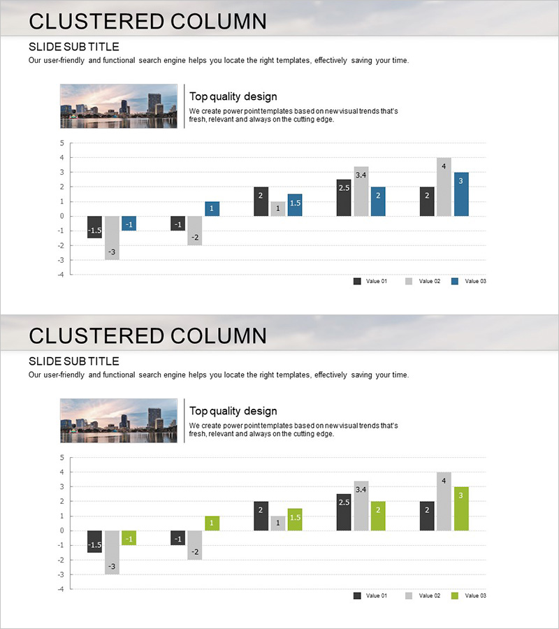
A clustered vertical bar chart PowerPoint slide optimized for market analysis and competitive benchmarking. This presentation template displays three data series side-by-side for intuitive item-by-item numerical comparison. The design uses black, gray, and blue color schemes to convey professionalism and credibility. With 2 slides included, you can repeat the same structure for multiple datasets or compare various metrics simultaneously. The 16:9 widescreen format ensures compatibility with modern presentation environments and displays.
Usage Points
-
Main Usage
Ideal for comparing multiple numerical values across three or more data series. Effectively visualizes market size, market share, and growth rates simultaneously, or displays competitive performance metrics side-by-side. The clustered layout clearly highlights differences between series within each category, making it perfect for detailed analytical presentations.
-
How to Use
Enter your analysis title and description in the header area. Replace the bar heights and numerical values with your actual data. Update the legend labels (Value 01, 02, 03) to match your data series names. Adjust colors to align with your organization's branding if needed. Duplicate the slides to present additional datasets.
-
Recommended For
Marketing professionals, business analysts, strategists, and executives presenting market conditions, competitive analysis, or sales performance comparisons. Suitable for quarterly performance reports, business proposals, investor pitch decks, and consulting presentations requiring data-driven decision-making.
-
Slide Structure
Each slide features a title and subtitle area at the top, with the chart occupying the central space. The chart displays 5 items on the X-axis (arranged sequentially) and a numerical range (-4 to 5) on the Y-axis. Each item is represented by three clustered bars in black, gray, and blue. Numerical labels appear above each bar for precise value identification.
Related Products
-

Vertical Bar Chart for Future Growth Prediction – Innovative Vision
#Market and Competitor Analysis #Graph #Competitor Analysis
-

Layout Design Presentation Template - Column Charts
#Market and Competitor Analysis #Graph #Competitor Analysis
-

Marketing and Analysis Presentation Template – Professional Data Visualization Design
#Market and Competitor Analysis #Graph #Competitor Analysis
-

Earth Analysis Bundle Vertical Bar Graph – Market and Competitor Analysis
#Market and Competitor Analysis #Graph #Competitor Analysis
