Equipment Demand Configuration Graph – Effective Visualization for Market Analysis
RJ0900031_13
- Last Update 08/25/2025
- File Size 0.4MB
- # of Slides 2
- File Format PPTX
- Slide Ratio 16:9
- Color
Keywords
- #Content-Based Slides
- #Design-Based Slides
- #Market and Competitor Analysis
- #Diagram
- #Graph
- #Market Share
- #Market Analysis
- #Table
- #Circles
- #Doughnut Chart
- #16:9
- #donut chart PowerPoint slide
- #pie chart presentation template
- #equipment demand composition graph
- #market analysis visualization
- #ratio comparison slide template
About the Product
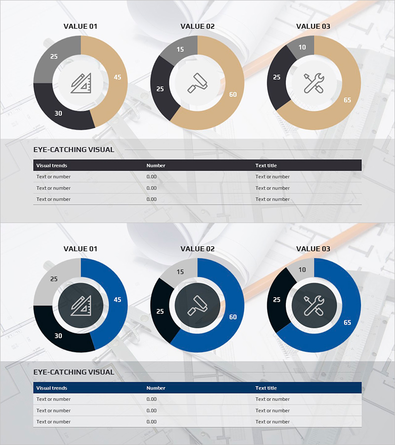
A professional donut chart PowerPoint slide designed for equipment demand analysis presentations. Three donut charts display demand composition percentages across different equipment categories, with segments in gray, black, and beige tones. Each chart features a centered icon for intuitive equipment type identification. The bottom table section allows input of visual trends, numerical data, and descriptive titles, making it immediately applicable to market analysis reports, product comparison presentations, and demand forecasting documents. The 2-slide set includes color variations (beige-black combination and blue accent version) to match your presentation style and corporate branding.
Usage Points
-
Main Usage
Effectively compare demand composition ratios across equipment or product categories and communicate market share, customer preferences, and sales composition at a glance. The centered icons in each donut chart provide intuitive category differentiation, making complex data easy to understand and visually compelling.
-
How to Use
Insert into the demand analysis section of market research reports, product portfolio presentations, and market overview sections of business plans. Replace segment percentages with actual data, populate the bottom table with trend descriptions and figures, and select the color variant that matches your presentation tone. Both slide versions maintain consistent design for professional continuity.
-
Recommended For
Marketing professionals, business analysts, product managers, and executive presenters. Particularly effective for B2B market analysis, industry reports, investor presentations, and management briefings where quantitative demand composition evidence is essential.
-
Slide Structure
Slide 1: Three donut charts in beige-black tones (3-4 segments each) with centered icons and bottom information table / Slide 2: Identical layout with blue accent color scheme. Each donut chart is independently editable; segment ratios, colors, and label text can be freely customized to match your data requirements.
Related Products
-

Analyzing Market Share with 3 Donut Charts and Tables
#Market and Competitor Analysis #Diagram #Graph
-

Business Status and Market Analysis Doughnut Slide – Harmony of Blue and Orange
#Business Introduction #Market and Competitor Analysis #Diagram
-

Competition and Cooperation Donut Charts
#Market and Competitor Analysis #Graph #Market Share
-

Donut Chart Visualizing Merchandise Sales Proportion
#Market and Competitor Analysis #Graph #Market Share
