Donut Chart Comparison Slide | Data Visualization PPT
RJ0600098_5
- Last Update 07/17/2025
- File Size 0.4MB
- # of Slides 2
- File Format PPTX
- Slide Ratio 16:9
- Color
Keywords
- #Design-Based Slides
- #Business Strategy
- #Market and Competitor Analysis
- #Graph
- #Achievements
- #Market Analysis
- #Circles
- #Doughnut Chart
- #16:9
- #donut chart PowerPoint slide
- #pie chart template
- #data visualization PPT
- #comparison analysis slide
- #performance report template
- #statistical graph presentation
About the Product
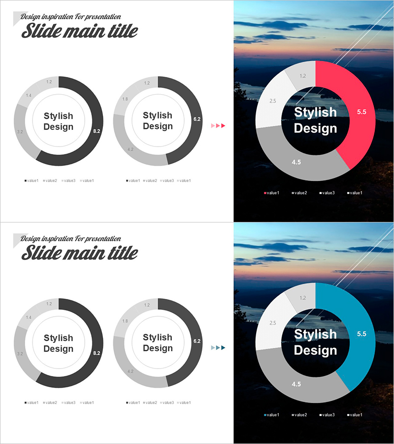
A 2-slide donut chart PowerPoint template featuring both light and dark design versions. Each slide displays a center circular area with a 4-segment donut-shaped pie chart for intuitive data visualization of ratios, composition, and performance comparison. Designed in 16:9 widescreen format for modern presentation environments. Perfect for sales analysis, marketing reports, business performance summaries, and statistical result presentations. Customize each segment with numerical values, percentages, and legends to match your data. Easily adjust colors to align with your brand identity and corporate guidelines.
Usage Points
-
Main Usage
Visualize data ratios, composition, and performance comparison using donut-shaped pie charts. Place key metrics or titles in the center circular area while displaying proportional data in the 4 outer segments. Effectively communicate marketing performance, revenue composition, customer distribution, market share, and other business metrics with clear information hierarchy.
-
How to Use
Use the light version for bright presentation environments and the dark version for dimly lit conference rooms or large-screen displays. Assign distinct colors to each data category segment and input numerical values, percentages, and legends so audiences instantly grasp proportions. Edit fonts, colors, and sizes globally through the slide master for consistency.
-
Recommended For
Marketing managers, sales directors, financial analysts, project managers, and executives. Ideal for quarterly revenue analysis, customer satisfaction surveys, product sales ratios, budget allocation, market research presentations, organizational structure reports, and any business presentation requiring structured quantitative data communication.
-
Slide Structure
Slide 1 (Light Version): Donut chart in white, gray, and black tones with center circular text area, 4 segments displaying values 12, 8.2, 4.5, 2.5, and bottom legend (value1–value4). Slide 2 (Dark Version): Black background with white, gray, and pink-toned donut chart, identical 4-segment structure, black center circular area, matching value and legend placement.
Related Products
-

Water Resources Donut Chart Presentation Template
#Business Strategy #Market and Competitor Analysis #Graph
-

Business Promotion Strategy Slide Template – Effective Market and Competitor Analysis
#Business Strategy #Market and Competitor Analysis #Graph
-

Cosmetic Ingredient Ratio Chart – Doughnut Slide for Market Analysis
#Business Strategy #Market and Competitor Analysis #Graph
-

Performance Analysis Graph by Field – Visualizing Business Performance
#Business Strategy #Market and Competitor Analysis #Graph
