Diagram for Visualizing Financial Plans – Grey Brown Design
RJ0900027_18
- Last Update 08/24/2025
- File Size 0.3MB
- # of Slides 2
- File Format PPTX
- Slide Ratio 16:9
- Color
Keywords
- #Content-Based Slides
- #Design-Based Slides
- #Financial Plans and Performance
- #Diagram
- #Capital Requirements
- #Key Financial Indicators
- #Table
- #Standard Table
- #16:9
- #financial table PowerPoint
- #data comparison slide
- #financial planning presentation
- #table diagram slide
- #financial analysis PowerPoint template
About the Product
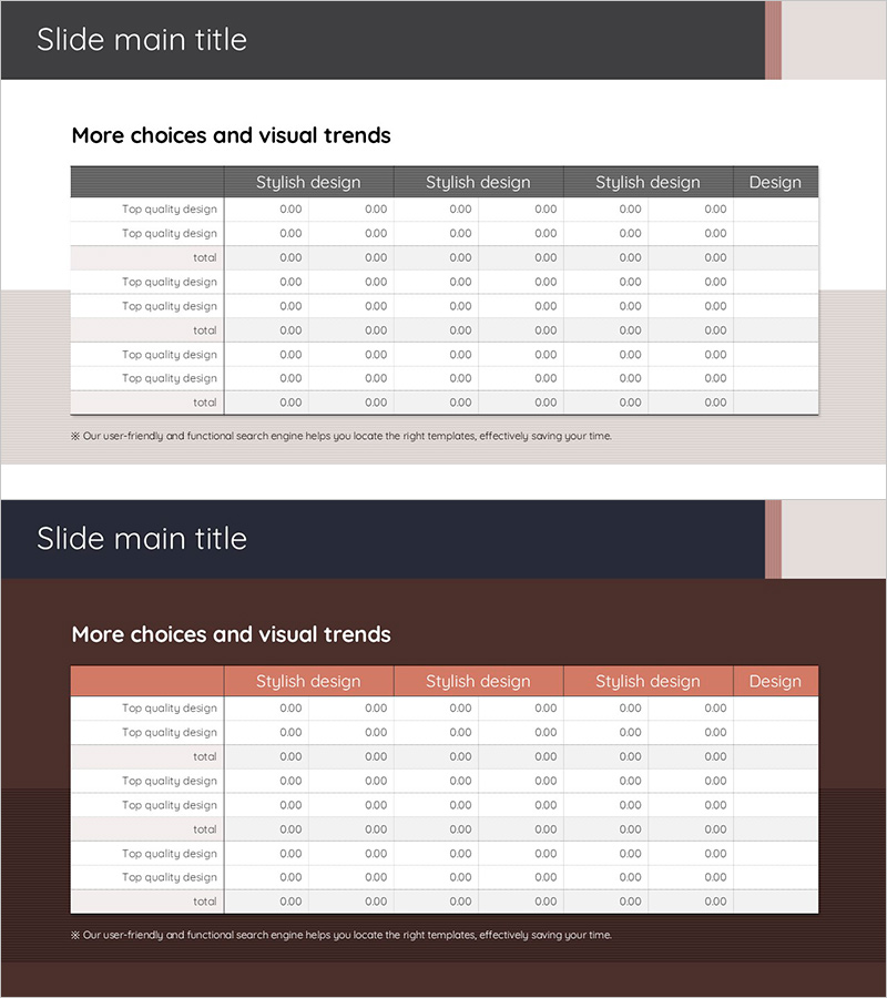
A 2-slide set designed for financial planning and performance analysis presentations. Features a table layout with grey and brown header rows and structured data entry areas across 6 columns, enabling side-by-side comparison of multiple financial metrics. Created in 16:9 widescreen format, this PowerPoint slide template is ideal for financial reports, business plans, and investment pitches where numerical data needs clear organization and visual hierarchy. All cells are fully editable, allowing you to input actual figures and customize content instantly.
Usage Points
-
Main Usage
Present financial data such as budgets, actual results, variances, and achievement rates in an organized tabular format for decision-making. Effectively compares multiple line items and metrics simultaneously across departments, quarters, or time periods.
-
How to Use
Enter category labels (e.g., Budget, Actual, Variance, Achievement Rate) in the header row, then input corresponding numerical data in subsequent rows. Enhance key figures through color highlighting or font size adjustments to draw attention to critical metrics.
-
Recommended For
Finance teams, executives, business planners, and investment managers presenting financial status reports, budget proposals, quarterly performance reviews, and investor pitch decks.
-
Slide Structure
Two-slide set with each slide containing a 6-column by 8-10 row data entry grid. Headers feature grey-brown backgrounds with white text for emphasis, while alternating light grey row backgrounds improve readability and data scanning efficiency.
Related Products
-

Social Network Wide Template Table – Financial Planning and Results
#Financial Plans and Performance #Diagram #Capital Requirements
-

Trend Color Wide Template Table – Emphasizing Financial Planning and Performance
#Financial Plans and Performance #Diagram #Capital Requirements
-

Curved Theme Purple Template Diagram – Key to Financial Planning
#Financial Plans and Performance #Diagram #Capital Requirements
-

Rainbow Presentation Template Chart and Icons – Enhance Your Financial Planning
#Financial Plans and Performance #Diagram #Capital Requirements
