Natural Environment Satisfaction Graph – Market and Customer Analysis
RJ0900026_27
- Last Update 08/24/2025
- File Size 0.5MB
- # of Slides 2
- File Format PPTX
- Slide Ratio 16:9
- Color
Keywords
About the Product
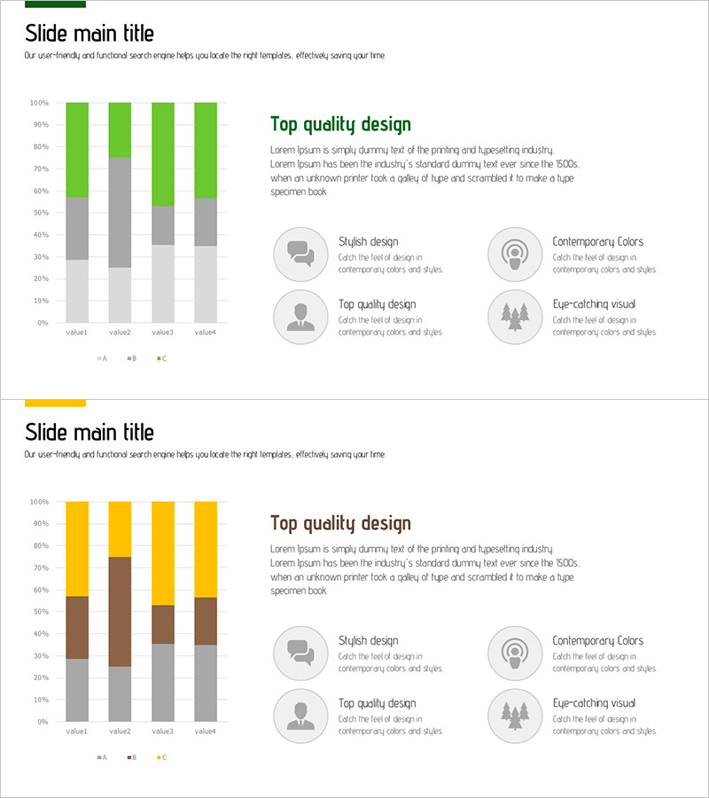
A PowerPoint slide designed to visualize natural environment satisfaction survey results for market and customer analysis presentations. The stacked bar chart uses four distinct colors—green, yellow, brown, and gray—to display satisfaction ratios across four data points (value1 through value4) in a single comparative view. The right section features four key design highlights presented through icons and descriptive text: stylish design, contemporary colors, top quality design, and eye-catching visuals. This 2-slide set includes a color-variant version with a yellow accent palette, ensuring consistent visual branding throughout your presentation. Fully editable PPTX format enables immediate customization.
Usage Points
-
Main Usage
Quantitatively visualize environmental satisfaction survey results to deliver data-driven insights during market and customer analysis sections. The stacked bar format simultaneously displays both total values and individual component proportions, making comparative analysis highly effective.
-
How to Use
Insert this slide into the 'Market Overview' or 'Customer Analysis' section of business plans, marketing strategy documents, or market research reports. Replace the legend labels (A, B, C) and numerical values with your own data for immediate deployment in client or investor presentations.
-
Recommended For
Ideal for companies in environmental and sustainability sectors presenting investment pitches or business plans; environmental consulting firms delivering customer analysis reports; government and public sector agencies explaining environmental policies; and marketing departments presenting customer needs analysis. Suitable for ESG-focused corporate communications.
-
Slide Structure
The slide layout comprises a title area (upper left) with subtitle text, a left-side stacked bar chart displaying four data categories at 100% scale, and a right-side section with four icon boxes containing descriptive text (max 50 characters each). Both slides maintain identical structure with only color palette variation, allowing flexible selection based on presentation flow and brand guidelines.
Related Products
-

Orange Hexagon Presentation Template Segmented Vertical Bar Graph – Market and Competitive Analysis
#Market and Competitor Analysis #Graph #Other
-

Work Performance Analysis Graph – Visually Representing Employee Performance
#Market and Competitor Analysis #Graph #Other
-

Space Industry Analysis Graph Chart – Market and Competitive Analysis
#Market and Competitor Analysis #Graph #Customer Analysis
-

Bar Chart Analysis of Causes of Marital Conflict
#Market and Competitor Analysis #Graph #Customer Analysis
