3 Area Charts – Present Growth Strategies Through Data Comparison
RJ0900025_25
- Last Update 08/23/2025
- File Size 0.5MB
- # of Slides 2
- File Format PPTX
- Slide Ratio 16:9
- Color
Keywords
About the Product
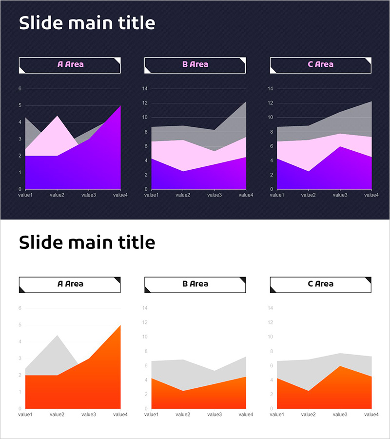
A PowerPoint slide featuring three independent area charts for visualizing multi-series data across different datasets. Provided in two design variations—dark background with purple, pink, and gray tones, and light background with orange and gray tones—allowing flexible integration into any presentation style. Each area chart displays four data points across three distinct regions (A, B, C), optimized for comparative analysis. Ideal for presenting growth trends, market share distribution, departmental performance, and strategic insights in business reports, investor pitches, and performance reviews.
Usage Points
-
Main Usage
Designed to compare three or more data series simultaneously and visualize trend changes over time. The stacked area structure effectively shows both individual series values and their cumulative impact, making it ideal for presenting proportional relationships and temporal evolution of complex datasets.
-
How to Use
Use in business strategy presentations, quarterly performance reports, and market analysis documents to compare departmental results, product performance, or regional metrics. The dark background suits executive-level reports and premium presentations, while the light background works well for growth-focused narratives and positive business stories. Simply input your data values and the charts update automatically.
-
Recommended For
Finance and accounting teams presenting quarterly results, marketing departments analyzing campaign performance across channels, sales teams comparing regional or product-line metrics, management consultants presenting client analysis, academic researchers comparing multiple variables, and investor relations professionals explaining growth trajectories.
-
Slide Structure
Two-slide set. First slide features dark background (purple, pink, gray tones) with three area charts; second slide uses light background (orange, gray tones) with identical chart layout. Each chart contains four data points (value1–value4) and three series (A, B, C Area), with horizontal gridlines and legend for enhanced readability and data interpretation.
Related Products
-

Crop Analysis Donut Circle Graph
#Market and Competitor Analysis #Graph #Market Share
-

Sugar Usage Analysis Area Graph – Revenue Projections and Market Analysis
#Business Strategy #Market and Competitor Analysis #Graph
-

Target Market Analysis World Map & Bar Graph
#Company Introduction #Market and Competitor Analysis #Graph
-

3D Printer Analysis Bar Graph
#Market and Competitor Analysis #Diagram #Graph
