Plant Icons and Area Charts – Enhance Business Insights with Modern Design
RJ0900021_20
- Last Update 08/22/2025
- File Size 0.1MB
- # of Slides 2
- File Format PPTX
- Slide Ratio 16:9
- Color
Keywords
About the Product
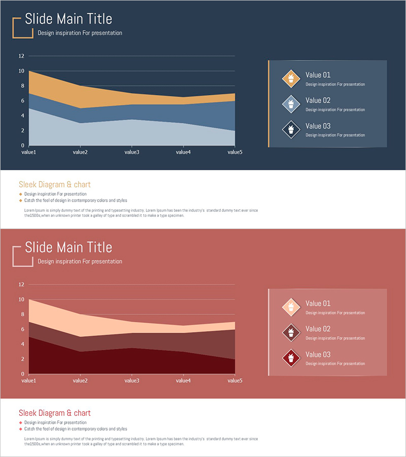
A professional area chart PowerPoint slide designed to visualize business data trends and cumulative values. The slide features a three-series stacked area chart with dark blue, orange, and light gray color gradients, enabling viewers to track changes over time and understand data composition at a glance. A legend with diamond-shaped icons on the right side clearly identifies each data series. This 2-slide template is ready to use in presentations, reports, and analytical materials, adding credibility to business communications.
Usage Points
-
Main Usage
Ideal for visualizing cumulative trends and changes over time across multiple data series. The stacked area format allows viewers to see both the total volume and individual component contributions simultaneously. Perfect for financial reports, sales analysis, market research, and performance dashboards.
-
How to Use
Slide 1 presents the main area chart with a dark blue background, three-series stacked areas, and a right-aligned legend with diamond icons. Slide 2 offers an alternative color scheme (wine red, beige, dark wine) for flexible theme matching. All data values and legend labels are fully editable, allowing you to input actual figures and deploy immediately.
-
Recommended For
Recommended for finance teams, marketing departments, and strategic planning units presenting quarterly reports and analytical findings. Ideal for expressing cumulative metrics such as revenue trends by customer segment, market share evolution, or departmental performance over time. Suitable for executive briefings, investor presentations, and internal strategy meetings.
-
Slide Structure
Each slide contains a title area, a three-series stacked area chart (5 data points on X-axis, 0-12 range on Y-axis), and a right-side legend with 3 labeled items and diamond icons. Gridlines and axis labels are clearly visible for easy data interpretation, with balanced spacing and alignment throughout.
Related Products
-

Triangular Prism Graph for Visualizing Market Status – Insights and Analysis
#Market and Competitor Analysis #Graph #Other
-

Cement Theme Competitor Analysis Graph – Market Insights
#Market and Competitor Analysis #Graph #Competitor Analysis
-

Competitor Idea Analysis Graph
#Market and Competitor Analysis #Graph #Competitor Analysis
-

Business Analysis Bilinear Bar Graph
#Market and Competitor Analysis #Graph #Competitor Analysis
