Horizontal Bar Ratio Graph – Visual Data Presentation
RJ0300020_17
- Last Update 04/23/2025
- File Size 1.2MB
- # of Slides 2
- File Format PPTX
- Slide Ratio 16:9
- Color
Keywords
About the Product
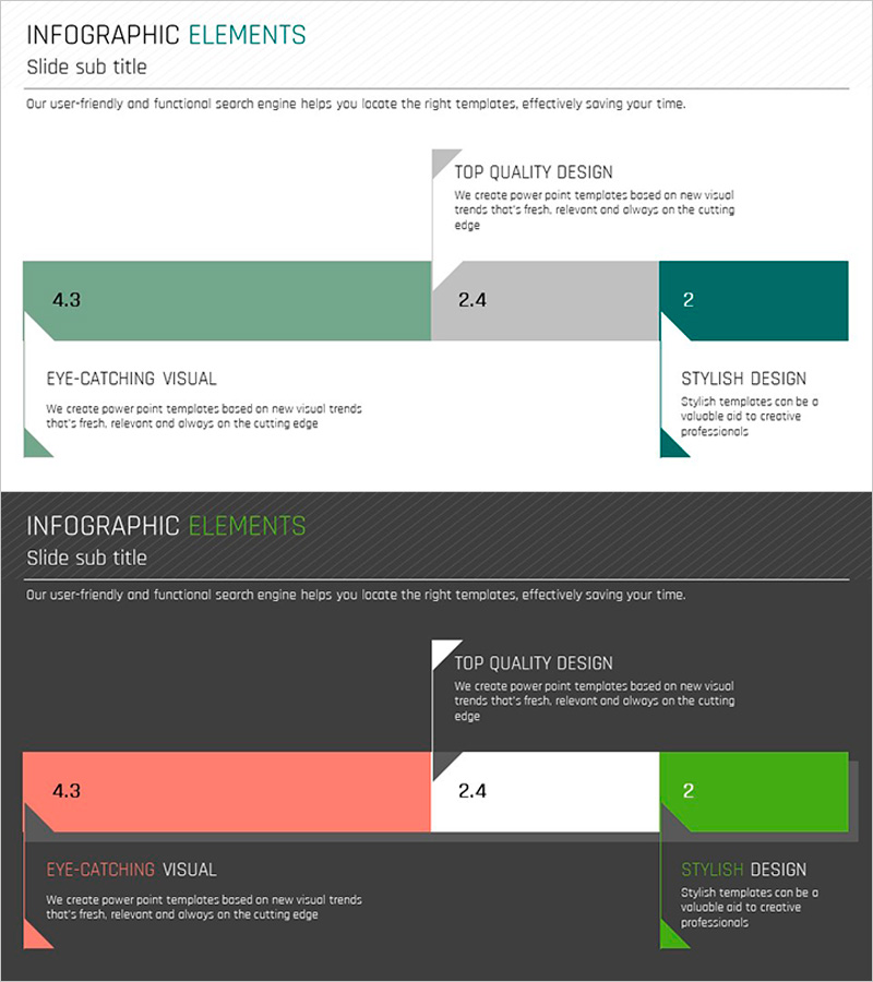
A PowerPoint slide template featuring horizontal bar graphs that visualize numerical ratios across three items. The bars are color-coded in green, gray, and teal to distinguish each data series, with values (4.3, 2.4, 2) clearly displayed for intuitive comparison. Triangle accent elements provide visual emphasis and guide viewer attention. This 2-slide set is ready to use in presentations, reports, and infographic layouts.
Usage Points
-
Main Usage
Designed to compare and visualize numerical ratios across multiple items at a glance. Ideal for reports, proposals, and marketing materials presenting performance metrics, market share, budget allocation, and comparative analysis.
-
How to Use
Simply replace the bar lengths and numerical values with your own data. The color-coded bars clearly distinguish each item, while triangle accent elements draw attention to key figures and data points.
-
Recommended For
Finance, marketing, and sales team performance presentations; market analysis reports; budget status updates; competitive analysis; customer satisfaction survey results; quarterly business reviews.
-
Slide Structure
Two-slide set, each featuring a horizontal bar graph with three data items. Bars are color-differentiated in green (4.3), gray (2.4), and teal (2), with triangle accent shapes positioned at the start of each bar for visual emphasis.
Related Products
-

Aging Graph – Effective Visualization for Market and Competitor Analysis
#Business Vision and Strategy #Market and Competitor Analysis #Diagram
-

Management System and Area Charts – Effective Business Strategies
#Business Strategy #Market and Competitor Analysis #Diagram
-

Customer Analysis with Horizontal and Vertical Bar Graphs – Market and Competitor Analysis
#Market and Competitor Analysis #Marketing Plan and Strategy #Diagram
-

User Analysis Status by Year – Growth and Change
#Product/Service Introduction #Market and Competitor Analysis #Graph
