Highlight Table Chart – Clear Visualization of Financial Performance
RJ0900020_13
- Last Update 08/21/2025
- File Size 6.1MB
- # of Slides 2
- File Format PPTX
- Slide Ratio 16:9
- Color
Keywords
- #Content-Based Slides
- #Design-Based Slides
- #Financial Plans and Performance
- #Diagram
- #Capital Requirements
- #Key Financial Indicators
- #Table
- #Standard Table
- #16:9
- #highlight table PowerPoint
- #financial data slide
- #comparison table presentation
- #table chart template
- #financial performance visualization
- #data comparison slide
About the Product
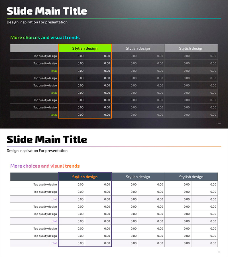
A highlight table PowerPoint slide that clearly compares financial performance and budget status. Designed with a dark background and lime green accent cells to immediately draw attention to key figures. The data table with 6 columns and 8 rows effectively communicates quantitative information such as financial planning, capital requirements, and quarterly performance comparisons. This 2-slide set adapts to various financial data structures and can be edited and used immediately for presentations.
Usage Points
-
Main Usage
A slide for comparing and analyzing quantitative data such as financial planning, budget status, quarterly performance, and capital requirements in table format. Lime green accent cells visually highlight key figures or achievement rates to focus audience attention.
-
How to Use
Use in financial reports, business plan presentations, investor briefings, and quarterly performance reviews to present budget vs. actual results, goal achievement rates, and departmental performance comparisons. Edit cell content and highlight positions to customize the table for your specific data.
-
Recommended For
CFOs, finance managers, business planning teams, executives presenting reports, and investor relations professionals who need to clearly communicate quantitative data. Particularly effective when data comparison and performance emphasis are required.
-
Slide Structure
2-slide set. Each slide features a table with 6 columns (item name + 5 data series) and 8 rows (header + 7 data rows). Dark gray background with 2-3 lime green accent cells and orange border framing the entire table to clearly distinguish the data area.
Related Products
-

Painting Template Table – Visualizing Financial Plans
#Financial Plans and Performance #Diagram #Capital Requirements
-

Rainbow Presentation Template Chart and Icons – Enhance Your Financial Planning
#Financial Plans and Performance #Diagram #Capital Requirements
-

Trend Color Wide Template Table – Emphasizing Financial Planning and Performance
#Financial Plans and Performance #Diagram #Capital Requirements
-

3 Main Tables and Summary Messages for Financial Insights
#Financial Plans and Performance #Diagram #Text Box
