Analyzing ABC District Occupancy with Doughnut Chart
RJ0900019_18
- Last Update 08/21/2025
- File Size 0.7MB
- # of Slides 2
- File Format PPTX
- Slide Ratio 16:9
- Color
Keywords
- #Content-Based Slides
- #Design-Based Slides
- #Market and Competitor Analysis
- #Graph
- #Other
- #Market Share
- #Market Analysis
- #Circles
- #Doughnut Chart
- #16:9
- #doughnut chart PowerPoint slide
- #pie chart regional analysis
- #market share comparison presentation
- #geographic data visualization
- #world map PowerPoint template
About the Product
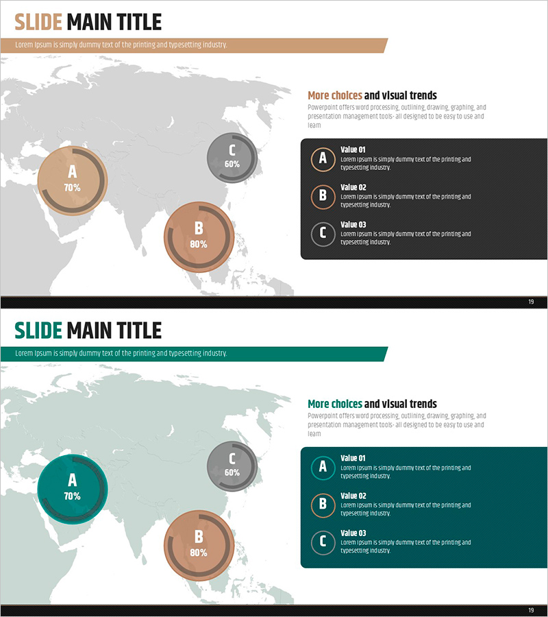
A professional PowerPoint slide featuring three doughnut charts for comparing regional market share at a glance. The tan and gray circular graphs display occupancy rates (70%, 80%, 60%) with a world map background, reinforcing global market context. Ideal for business reports, sales presentations, and investment pitches where regional performance, market penetration, or geographic distribution needs clear visualization. Provided in editable PPTX format with 16:9 widescreen ratio for modern presentation environments.
Usage Points
-
Main Usage
Visualize regional market share, geographic distribution, and comparative performance metrics. Three doughnut charts enable simultaneous display of multiple regions' occupancy rates, facilitating quick relative size comparison while the world map background emphasizes global scope.
-
How to Use
Insert into business reports, marketing presentations, or investor pitch decks in the market analysis or regional performance section. Edit the percentage values in each doughnut chart with actual data and replace Value 01–03 labels with region names for immediate deployment.
-
Recommended For
Sales managers, marketing directors, executives, regional managers, and consultants presenting market conditions. Particularly effective for multinational corporations, geographic expansion strategies, sales performance reviews, and market penetration comparisons.
-
Slide Structure
2-slide set. Slide 1: Three tan and gray doughnut charts (70%, 80%, 60%) with world map background and black legend box with 3 value items on the right. Slide 2: Identical layout with teal color scheme for design variation.
Related Products
-

Donut Chart & Map Template for Social Network Visualization
#Market and Competitor Analysis #Graph #Other
-

Doughnut Chart Slide Visualizing Market Share by Country
#Market and Competitor Analysis #Graph #Other
-

Purple Brown Market Share Analysis – Emphasizing Visual Appeal
#Market and Competitor Analysis #Graph #Other
-

World Map and Share Chart for Market Analysis – Effective Data Visualization
#Market and Competitor Analysis #Graph #Other
