Free Orange Area Chart – A New Approach to Data Visualization
RJ0900017_27
- Last Update 08/20/2025
- File Size 0.3MB
- # of Slides 2
- File Format PPTX
- Slide Ratio 16:9
- Color
Keywords
About the Product
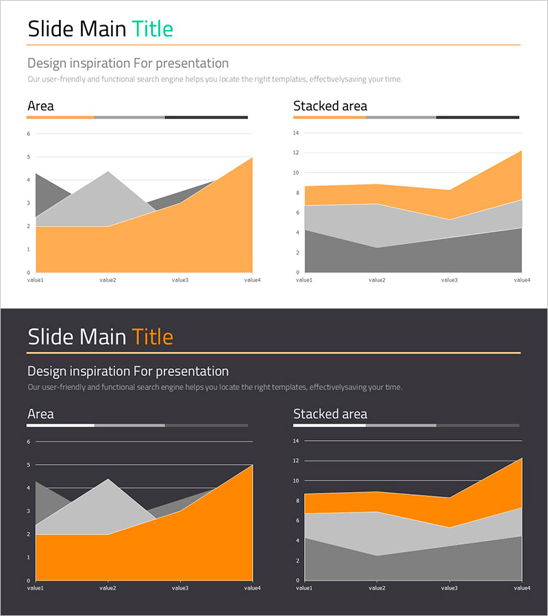
Visualize data trends and changes over time with this area chart PowerPoint slide template. The design features orange, gray, and black color schemes arranged in two distinct layouts: a standard area chart for single-series data and a stacked area chart for multi-series comparison. Each layout displays four data points across three data series, making it ideal for presenting financial performance, sales trends, or market analysis. The 16:9 widescreen format with 2 slides is fully editable and ready for immediate use in business presentations.
Usage Points
-
Main Usage
This template is designed to visualize numerical changes and trends over time using area graphs. It supports both single-series trend tracking and multi-series cumulative analysis, making it suitable for financial reports, sales performance, market share analysis, and other business data presentations.
-
How to Use
Use the standard area chart to track changes in a single data series over time. Apply the stacked area chart to show how multiple categories contribute to a total value while displaying their individual trends. Customize the orange, gray, and black colors to match your corporate branding or presentation theme.
-
Recommended For
Finance teams presenting quarterly earnings reports, marketing teams analyzing campaign performance, sales teams showcasing revenue trends, and executives delivering business status updates. Ideal for data-driven decision-making meetings and reports where clear visualization of numerical changes is essential.
-
Slide Structure
Slide 1: Standard area chart with 4 data points (value1–value4) across 3 data series (orange, gray, black) showing individual trends. Slide 2: Stacked area chart displaying the same 4 data points in cumulative format, illustrating total values and each series' proportional contribution. Both slides include axis labels and gridlines for clarity.
Related Products
-

User Analysis Graph Visualization – Market and Customer Insights
#Market and Competitor Analysis #Graph #Other
-

Current Status of Global Target Market Analysis – Strategic Insights through Data Visualization
#Company Introduction #Marketing Plan and Strategy #Graph
-

User Analysis Results Diagram - Infographic for Customer Insights
#Market and Competitor Analysis #Graph #Other
-

Horizontal Bar Graph for Competitor Analysis – Effective Data Visualization
#Market and Competitor Analysis #Graph #Competitor Analysis
