Horizontal Bar Graph for Competitor Analysis – Effective Data Visualization
RJ0300023_28
- Last Update 04/24/2025
- File Size 0.3MB
- # of Slides 2
- File Format PPTX
- Slide Ratio 16:9
- Color
Keywords
- #Content-Based Slides
- #Design-Based Slides
- #Market and Competitor Analysis
- #Graph
- #Competitor Analysis
- #Market Analysis
- #Horizontal Bar
- #Grouped Horizontal Bar
- #16:9
- #horizontal bar chart PowerPoint
- #bar graph slide template
- #data comparison chart
- #competitor analysis presentation
- #ROI visualization
- #market analysis PPT template
About the Product
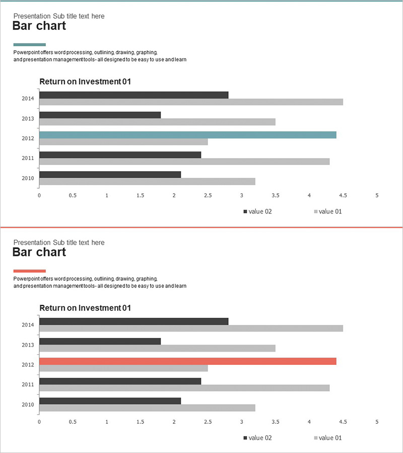
A horizontal bar chart PowerPoint slide optimized for competitor analysis and market research presentations. This slide template displays two data series side-by-side across five years (2010–2014), enabling clear numerical comparisons at a glance. The design uses a three-color palette—charcoal, gray, and teal—to distinguish data series, with an X-axis scale from 0 to 5 for visualizing financial metrics such as return on investment (ROI). The 2-slide deck presents the same chart in different color themes, allowing you to select the version that best matches your presentation background or brand colors. Delivered in 16:9 widescreen PPTX format, the slides are fully editable in all major presentation software and ready to use immediately.
Usage Points
-
Main Usage
Display year-over-year or item-by-item numerical comparisons using horizontal bar format, making it easy to analyze competitor performance, market share, and financial indicators at a glance. The dual-series layout is ideal for relative performance analysis.
-
How to Use
The 2-slide set offers the same chart in two distinct color themes: teal-charcoal-gray and charcoal-gray combinations. Choose the version that complements your presentation background or corporate branding. Simply double-click the legend and axis labels to replace them with your actual data for immediate use.
-
Recommended For
Perfect for executive reports, investor pitch decks, marketing strategy presentations, and business performance reviews where you need to emphasize competitive positioning. Finance teams, strategy departments, marketing teams, and sales teams can use this as a data-driven decision-making tool.
-
Slide Structure
Each slide contains a title area, descriptive text, and a horizontal bar chart. The chart displays five years (2010–2014) on the Y-axis, with two data series (value 01 and value 02) shown side-by-side for each year. The X-axis ranges from 0 to 5, representing the numerical scale, and a legend distinguishes the two series.
Related Products
-

Mobile Market Analysis Graph – Insights on Market Trends
#Market and Competitor Analysis #Diagram #Graph
-

Blue Orange Bundle Bar Graph - Insights for Market Analysis
#Market and Competitor Analysis #Graph #Competitor Analysis
-

Medical Record Analysis Bar Graph – Market and Competitor Analysis
#Market and Competitor Analysis #Graph #Competitor Analysis
-

Comparative Analysis Bar Graph – Data-Driven Market Insights
#Market and Competitor Analysis #Graph #Competitor Analysis
